Eclipse Product Line Branding & Visual ID
Art Direction / Logo Design / Product & Retail Packaging
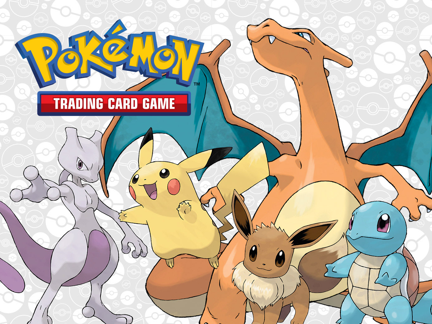
The goal was to develop a new deck protector line for trading card games, such as Magic the Gathering and Pokemon, where my design was selected over two others for how it artfully integrated different elements into a cohesive design, ensuring market fit through a creative approach that effectively met design criteria.
This approach resulted in a cohesive brand identity that enhanced market appeal and delivered a visually impactful design for the Eclipse line, driving art direction, branding, packaging and marketing efforts that grew to include additional products with consistently applied branding, with core elements preserved through multiple refreshes, demonstrating the design's durability in a competitive market.
Development & Design
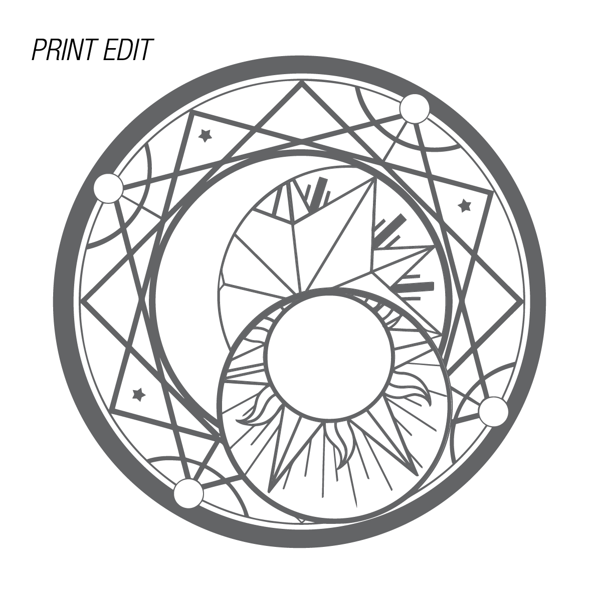
The Design team was provided some elements to use in concepting the logo. I felt the Magic Circle element was a natural fit for the Eclipse brand, and considered ways of integrating it into the design. I immediately recognized the need to adjust the element for rotogravure printing onto PP film, and did so by simplifying and thickening the linework, keeping in mind detail tolerance and registration.
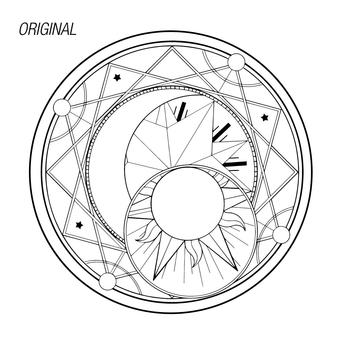
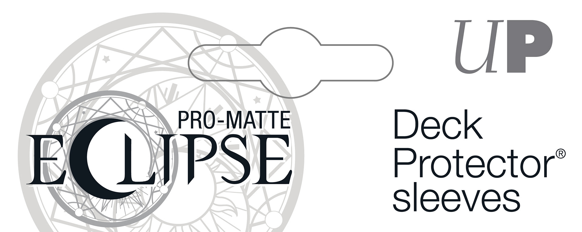
The Magic Circle element was provided and integrated into the design of the logo
The refined Magic Circle element retains the design of the original element with a cleaner, more defined presence, in a way that achieves printability and integrates with the logo.
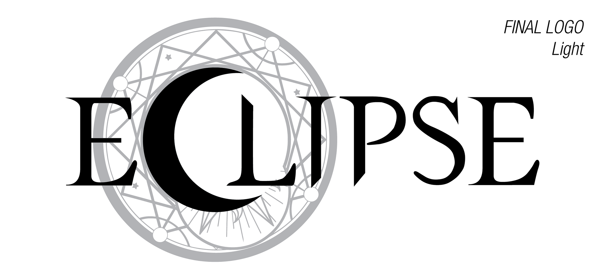
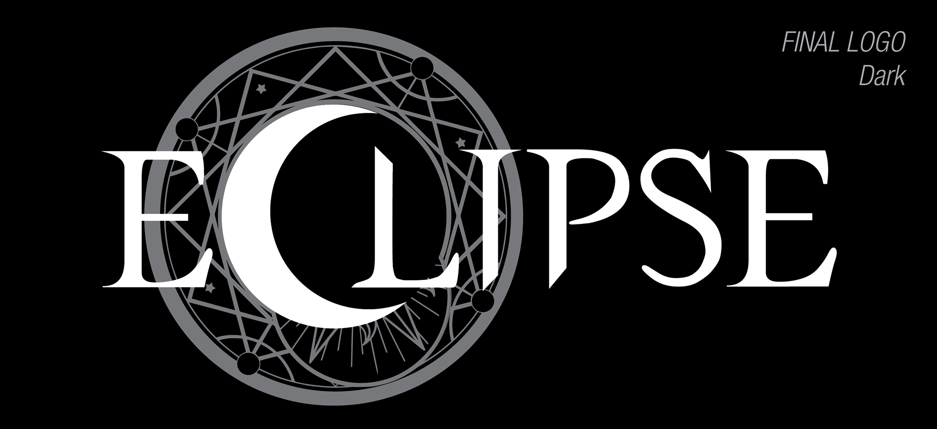
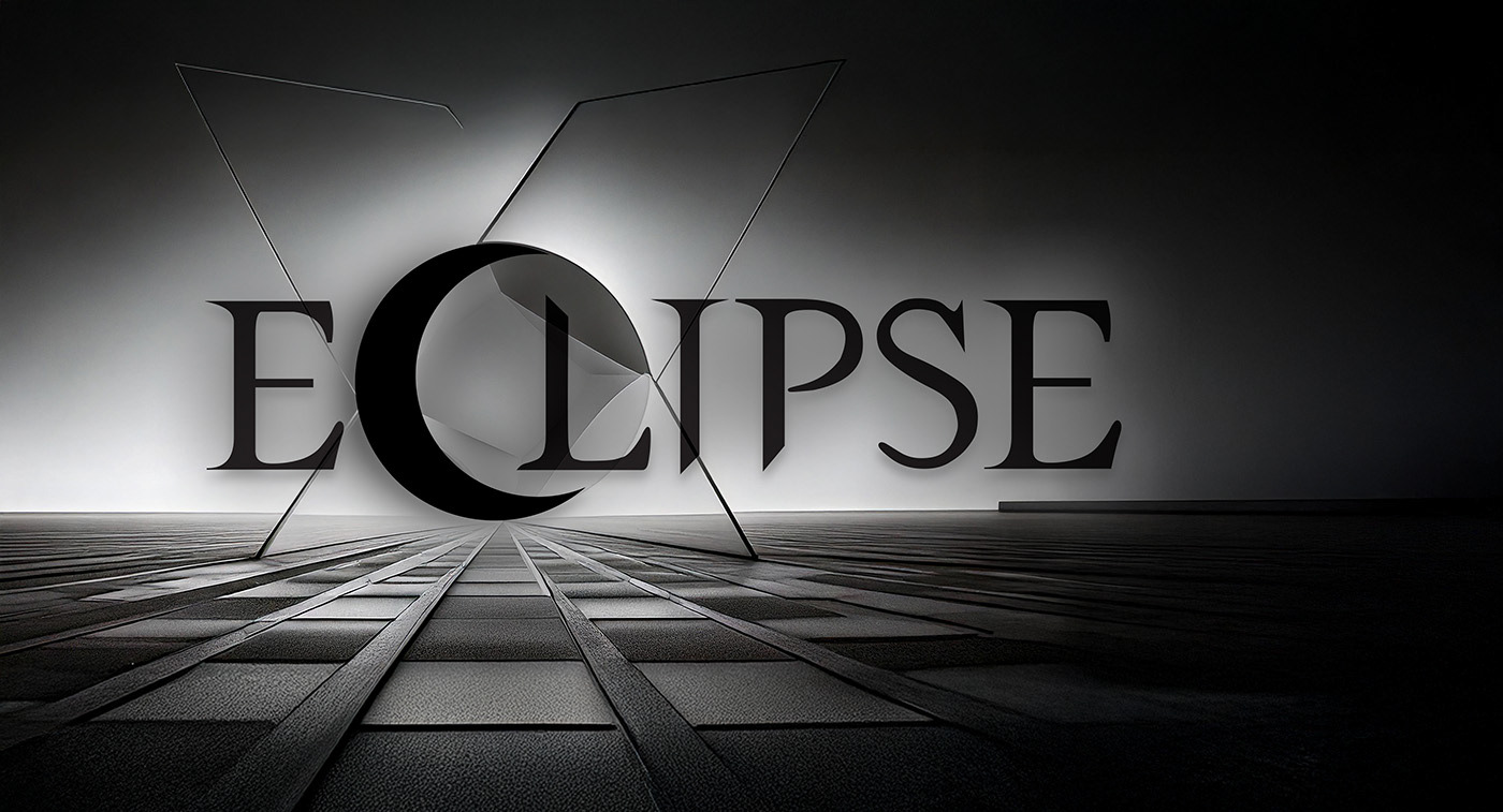
Final Logo
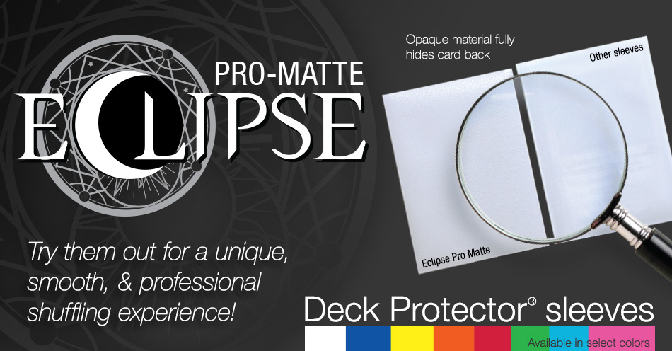
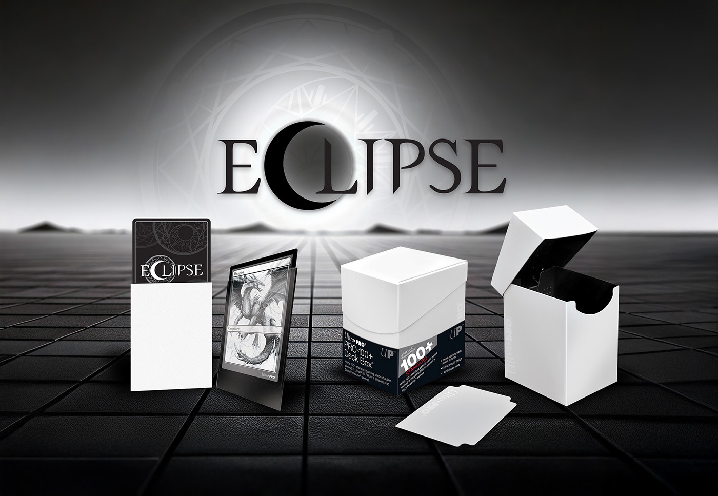
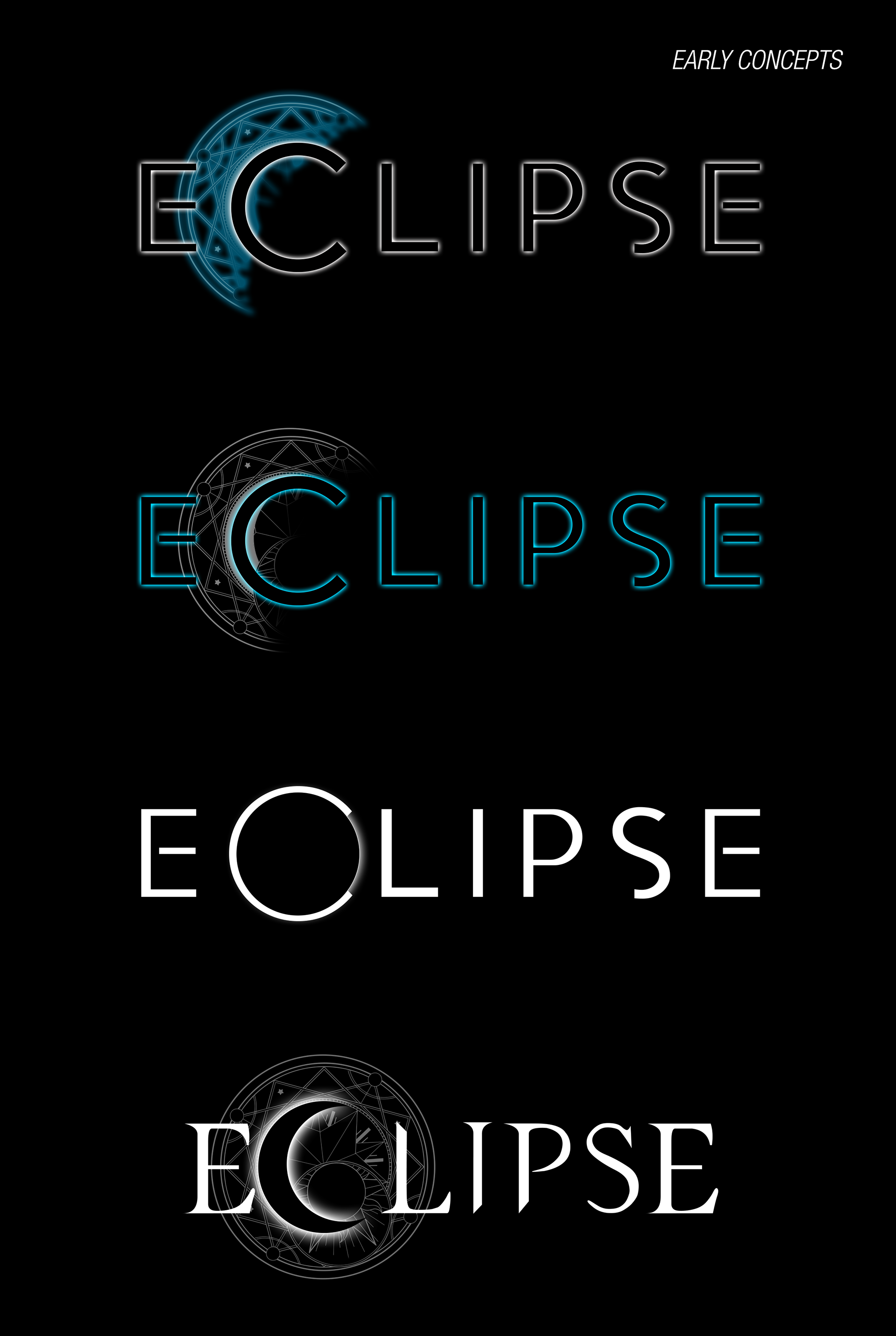
The final logo merges the Magic Circle with an "Eclipse Moon" element in a lockup with stylized type, tying together the visual elements into a logo that projects the Eclipse brand to the target market of premium trading card protection and accessories.
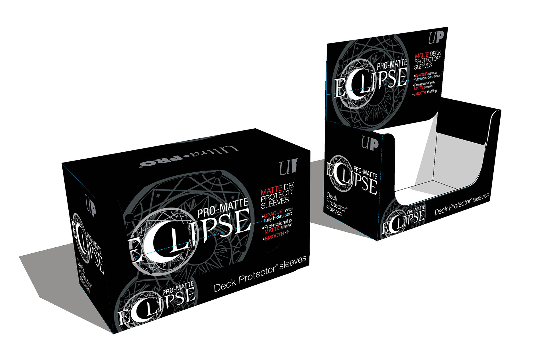
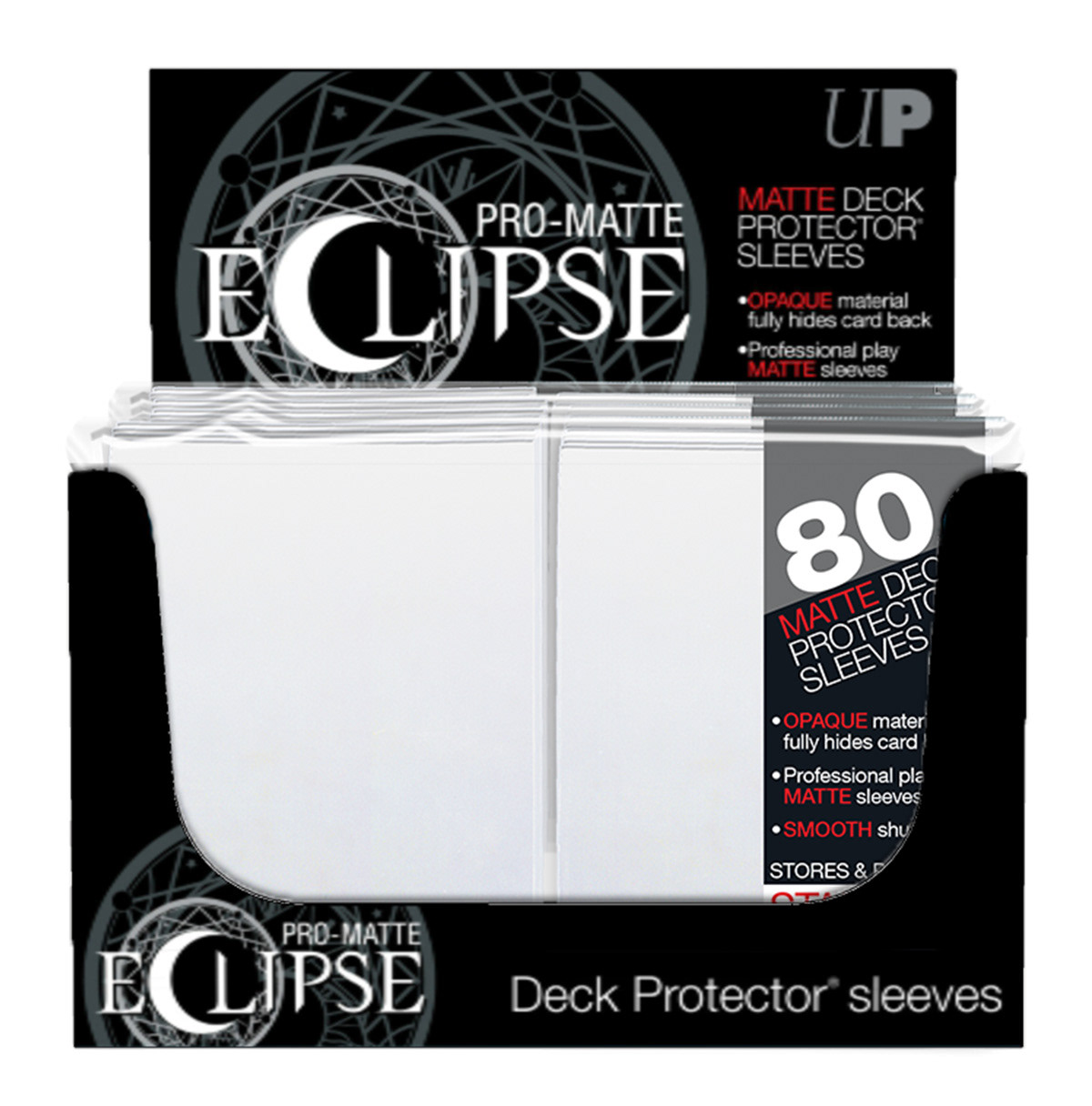
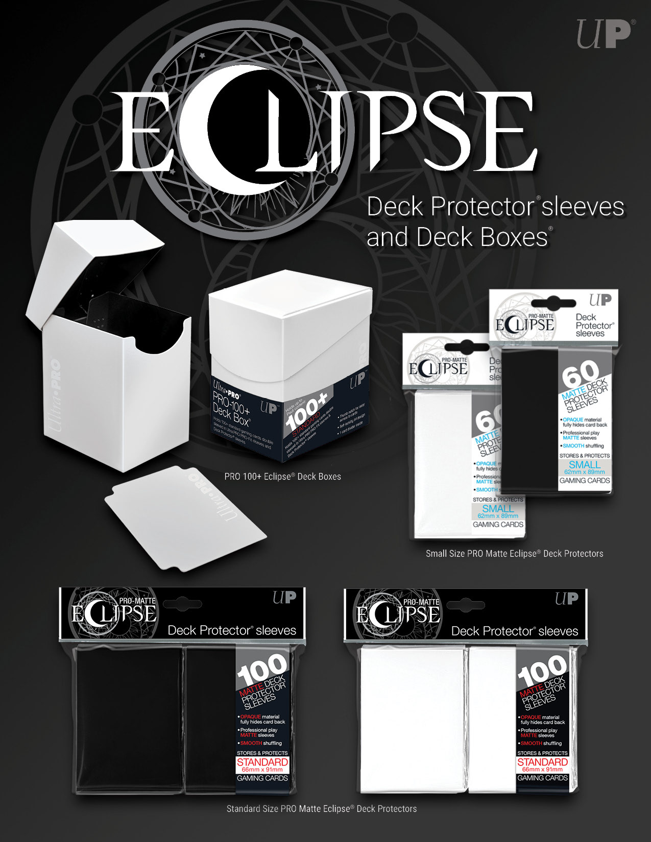
Eclipse Deck Protector Product & Retail Packaging
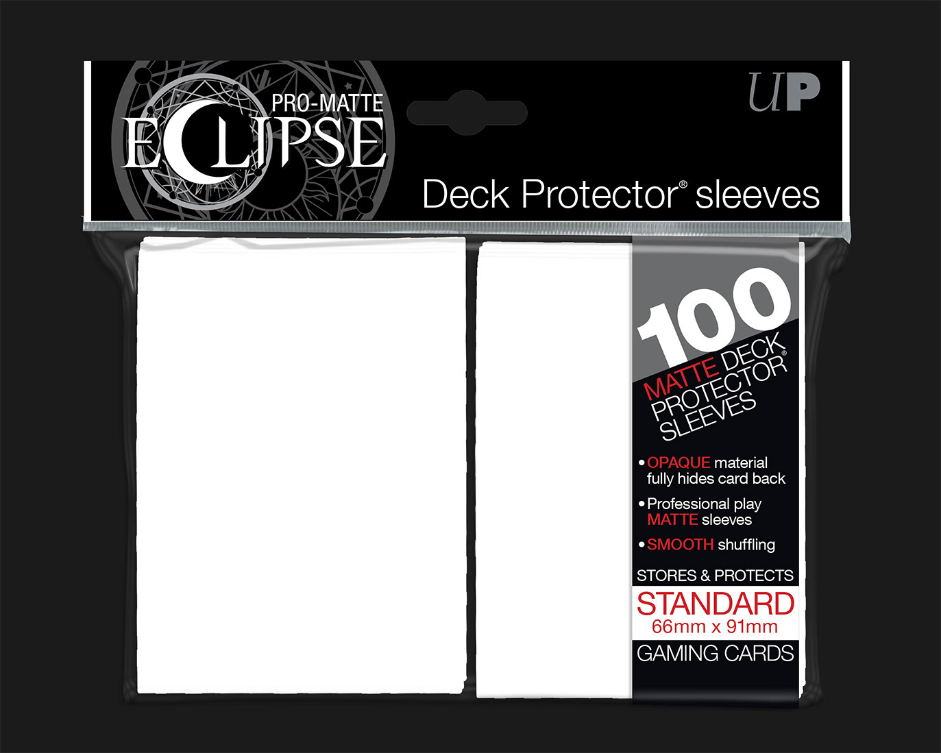
PP Film Adhesive Package / Retail Display Box
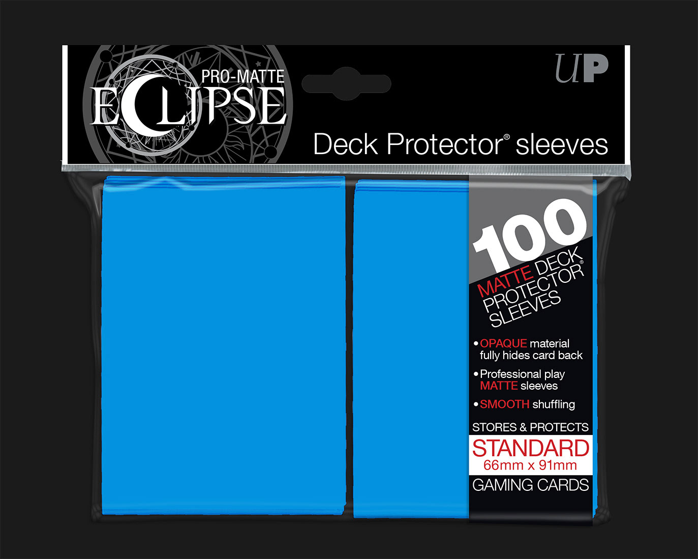
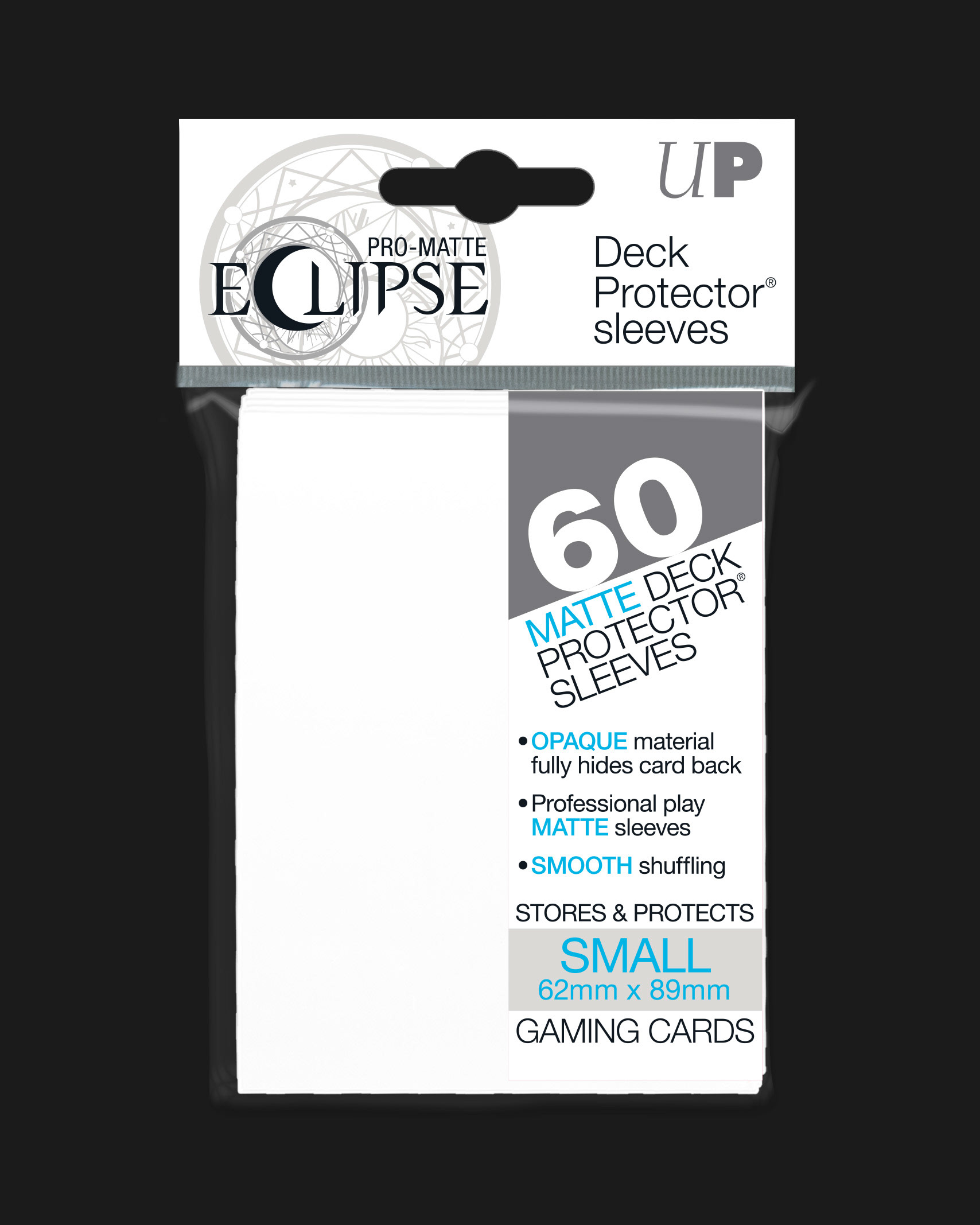
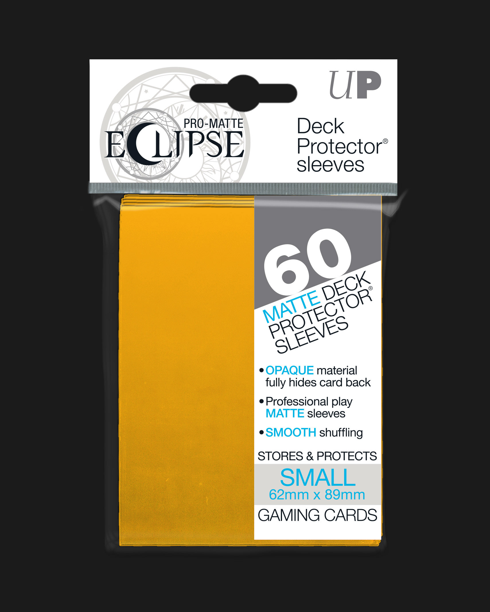
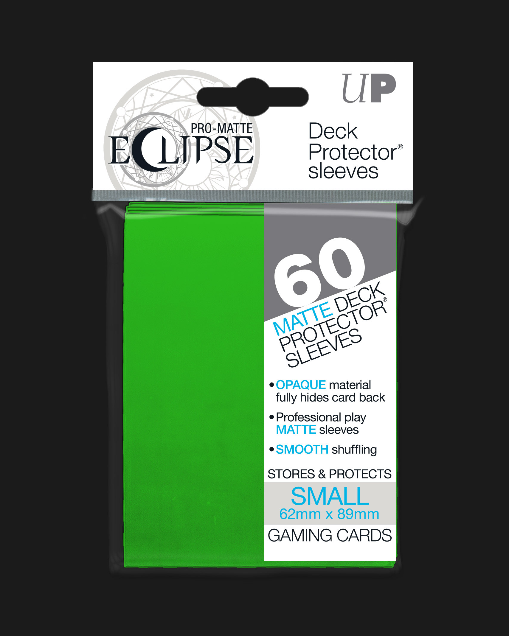
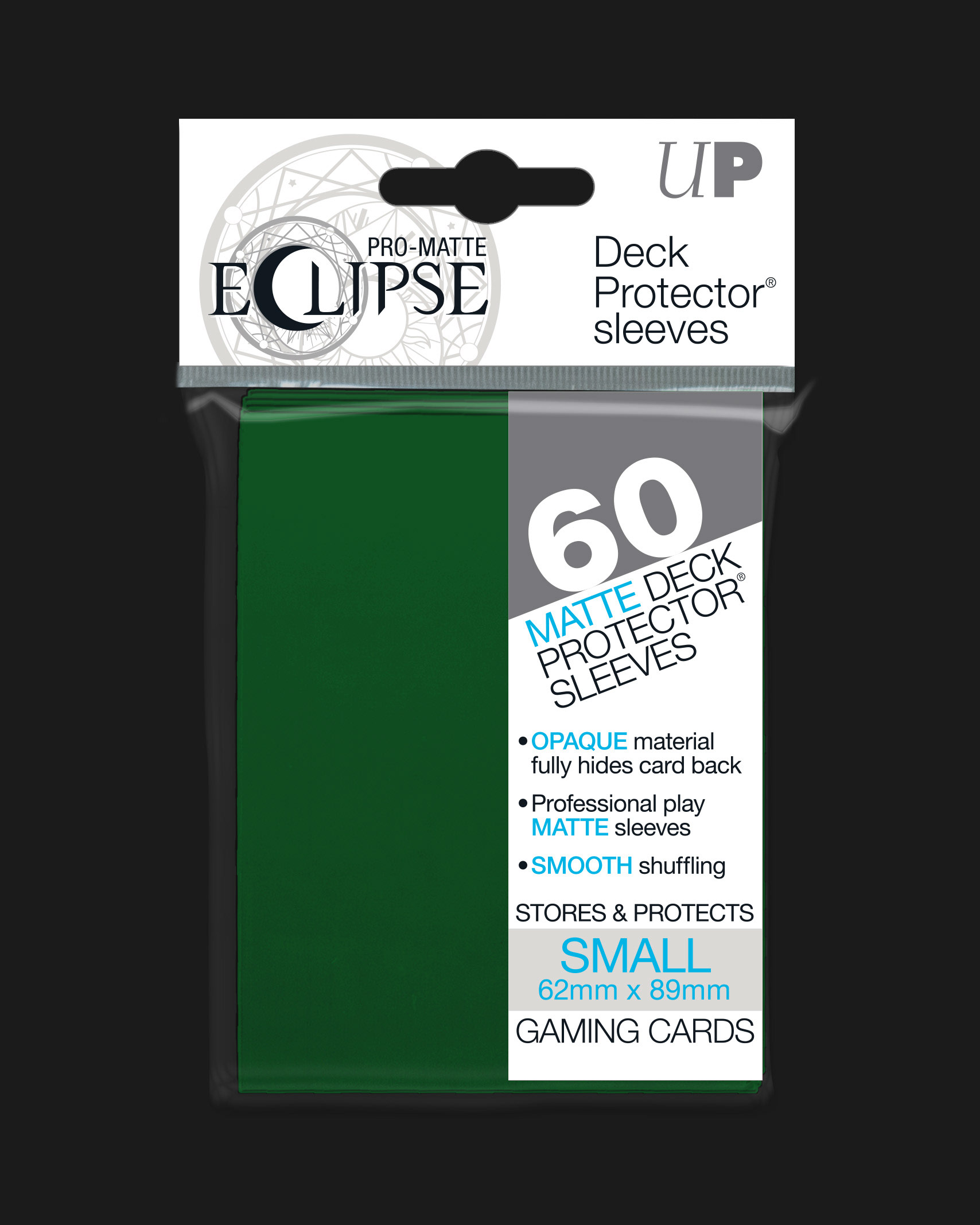
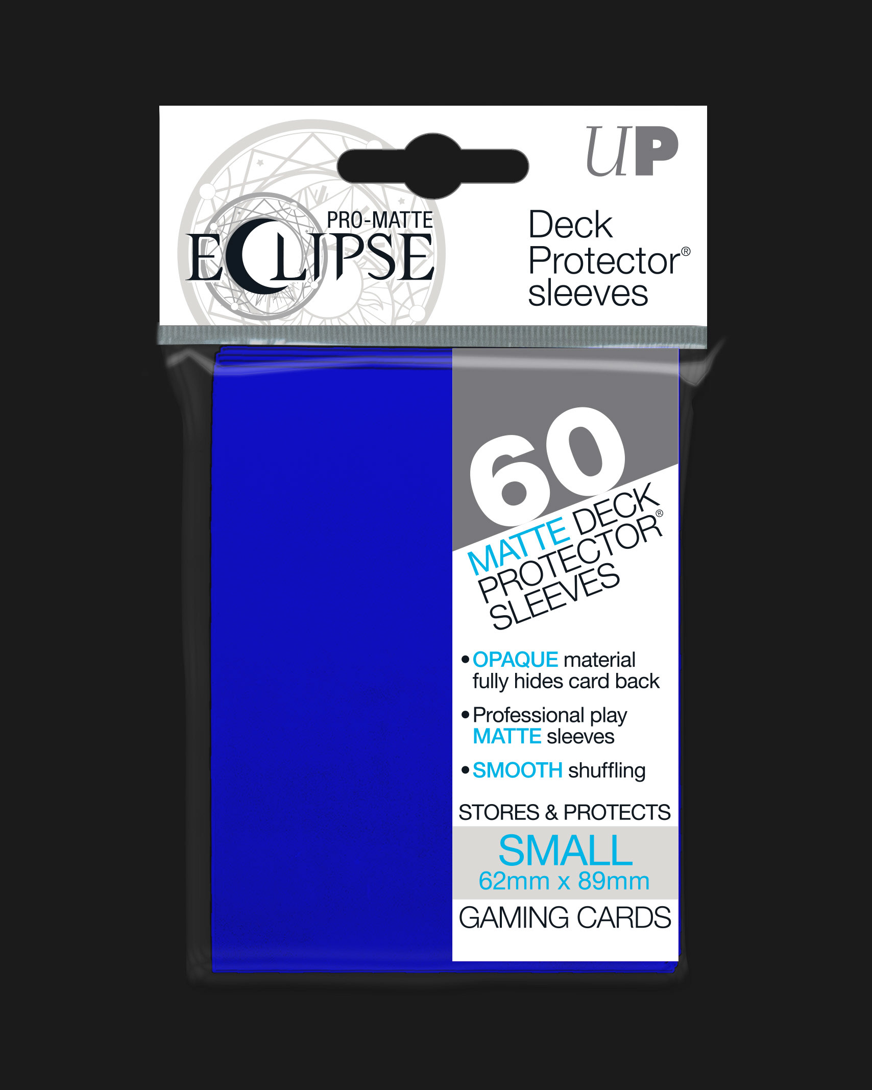
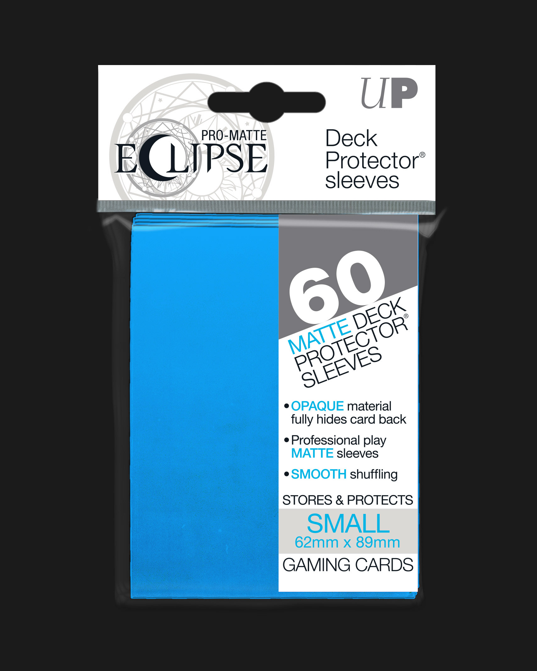
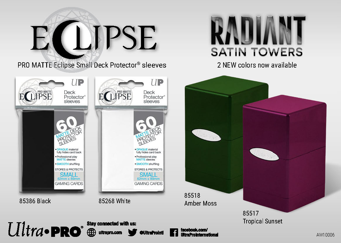
Two versions of the deck protector packaging were developed, one for standard size TCG cards and another for smaller Japanese TCG size cards. A clean, modern but familiar typeface was chosen for headline text and copy, while spot colors where used where necessary to maintain color consistency in print.
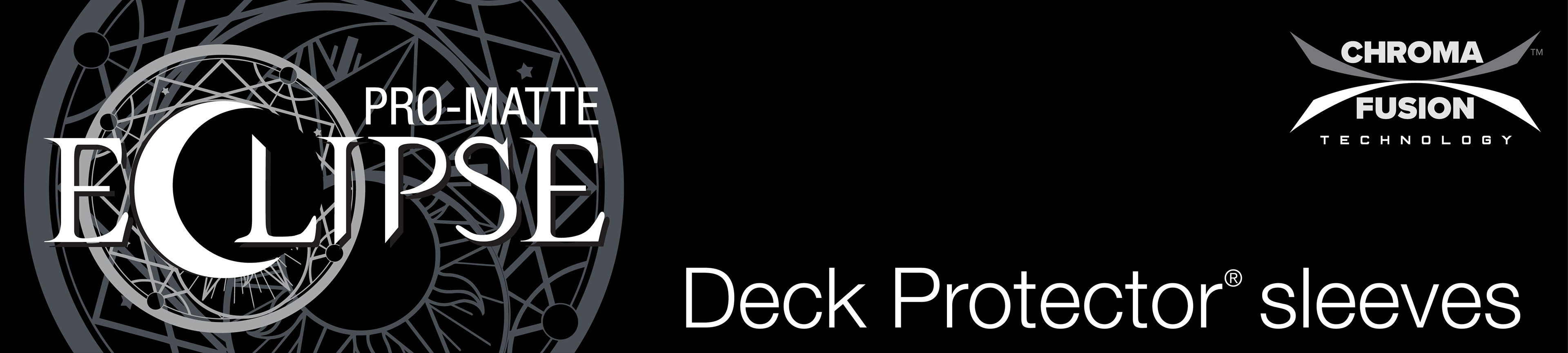
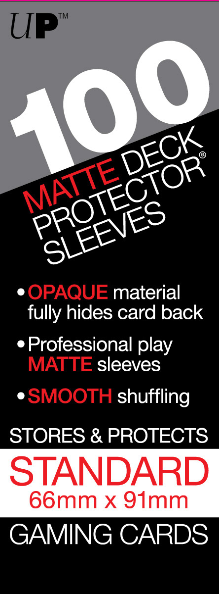
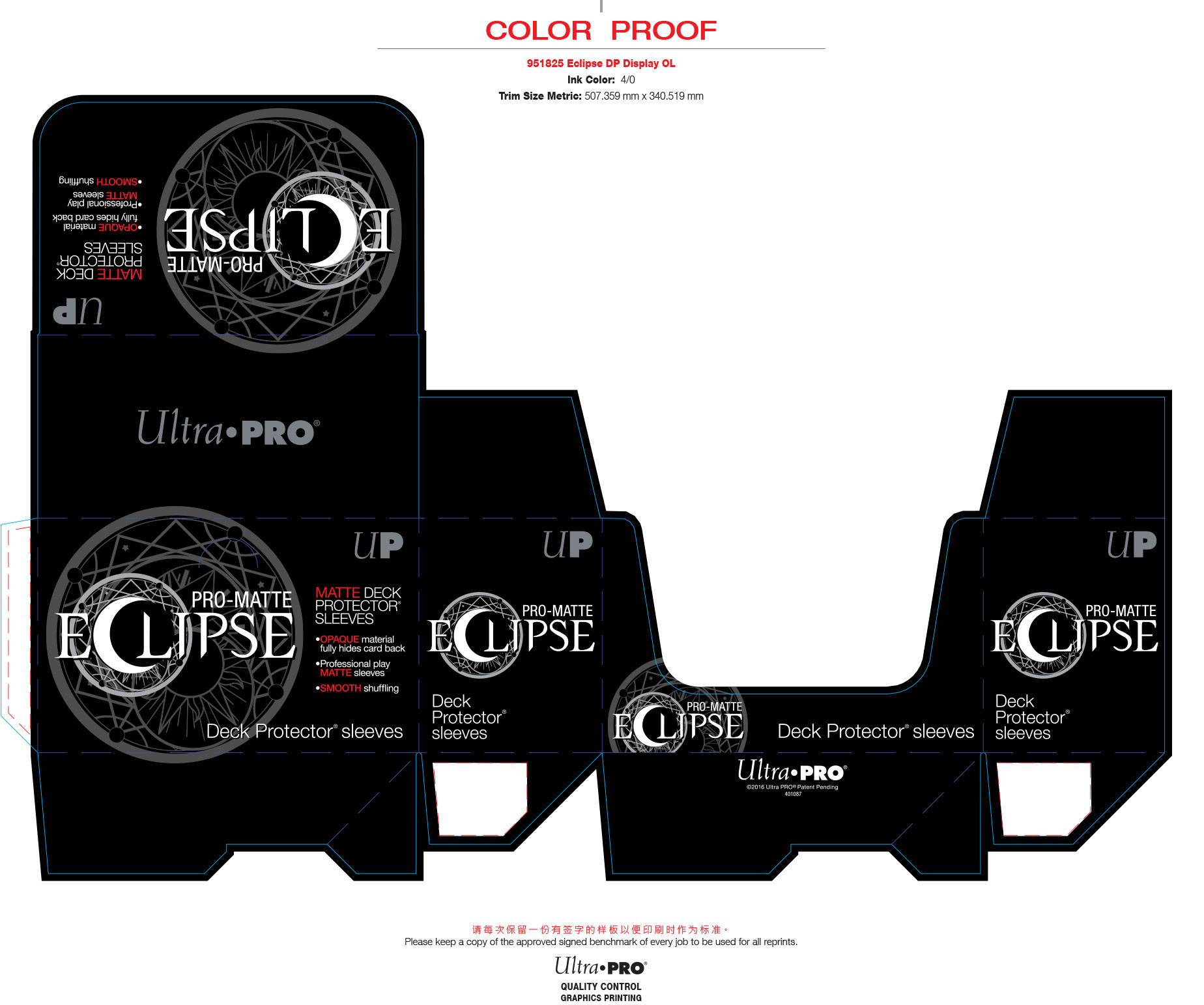
Eclipse Deck Protector Polybag Header
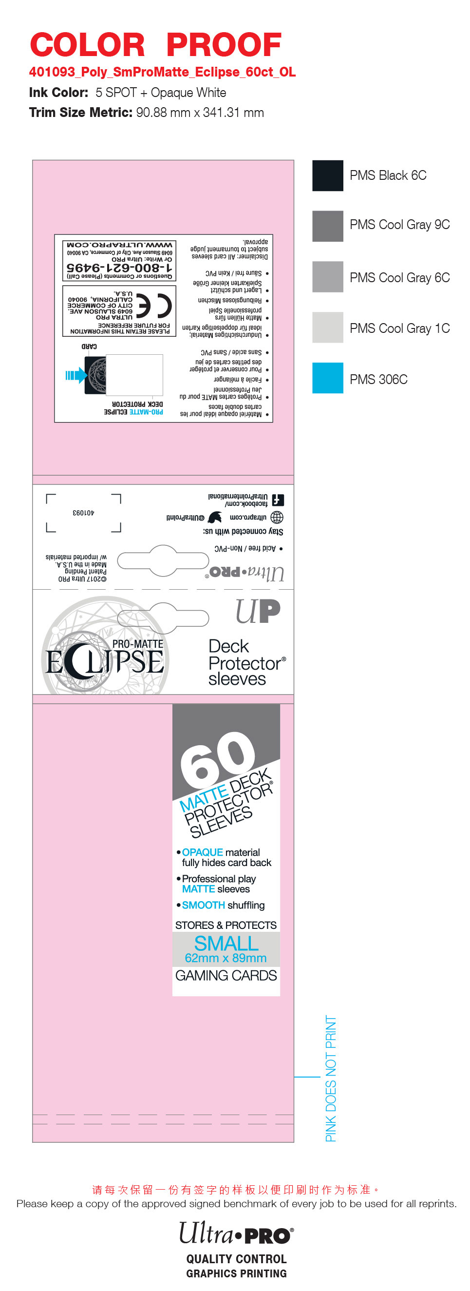
The rotogravure printing process on clear polypropylene film requires a layer of white ink as a base for printing all other colors, which must be kept in mind when making design choices, especially for spot colors; it requires visualizing color separations, similar to the silk screening process for apparel.
Another challenge was designing with the prescribed copy, which required careful and painstaking attention to alignment and spacing not only in deign composition, but also in typography, with leading and kerning needing to be adjusted with fine detail.
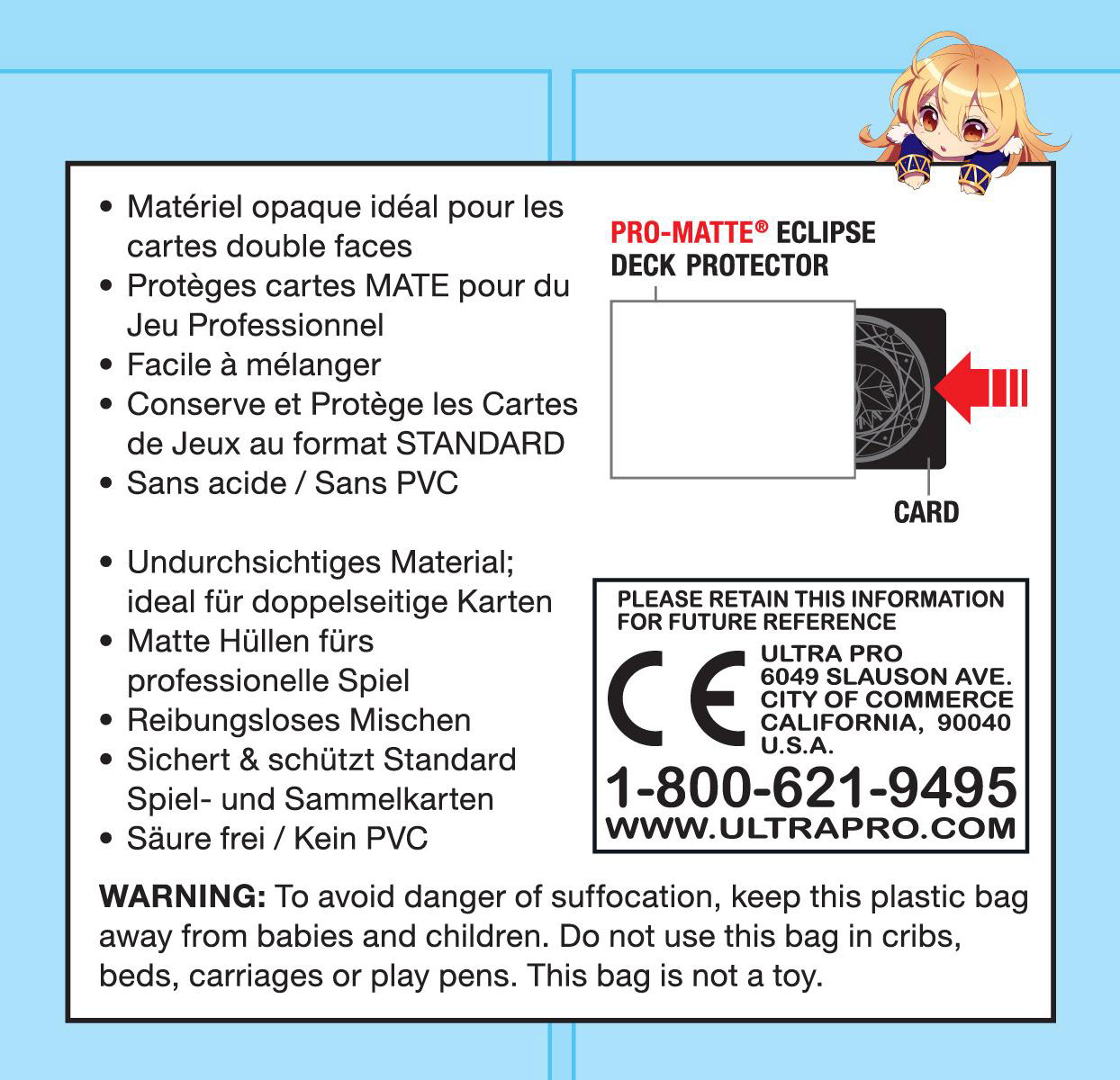
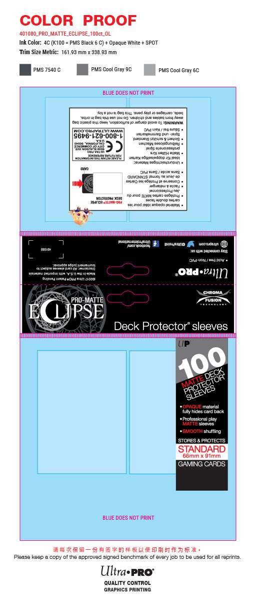
Eclipse Polybag sidebar, rear and color proof, used for factory press checks
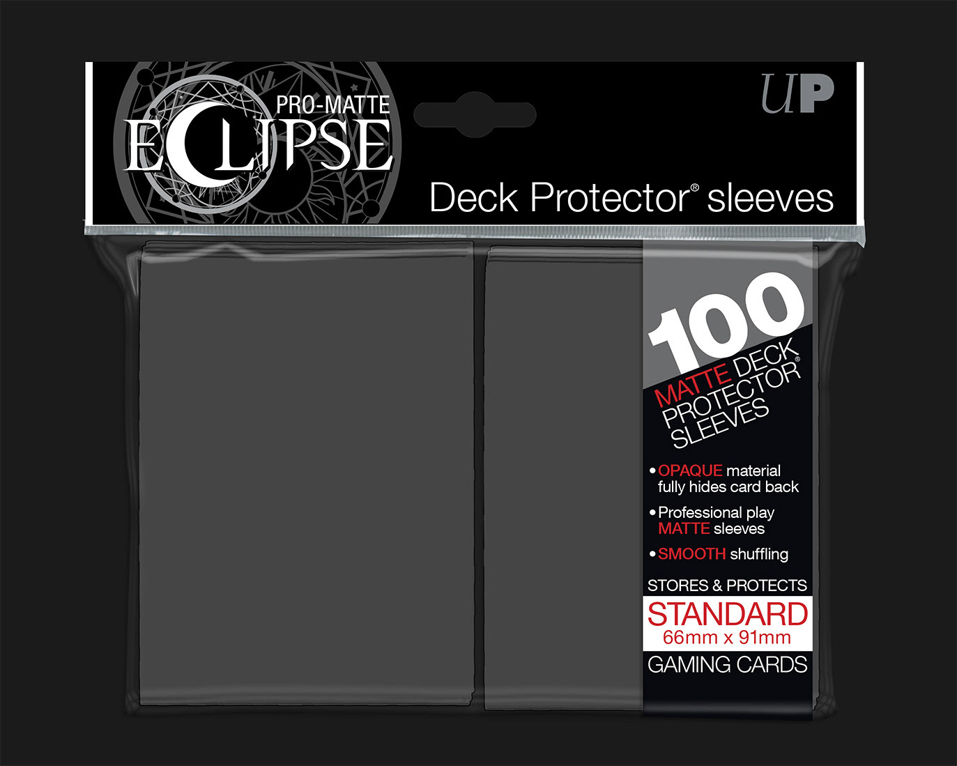
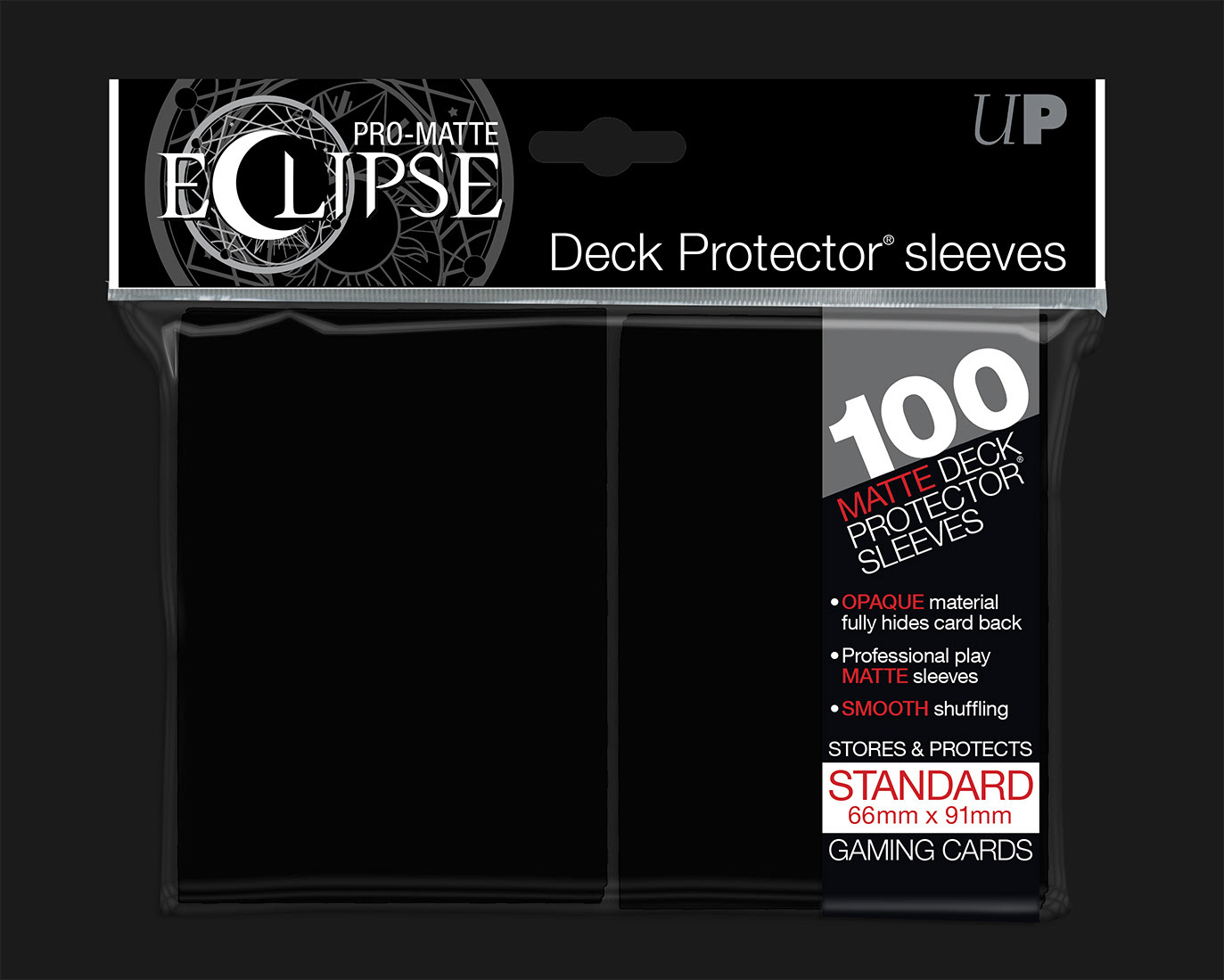
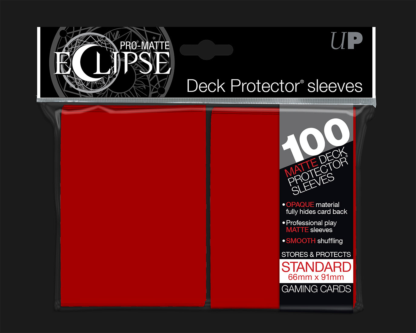
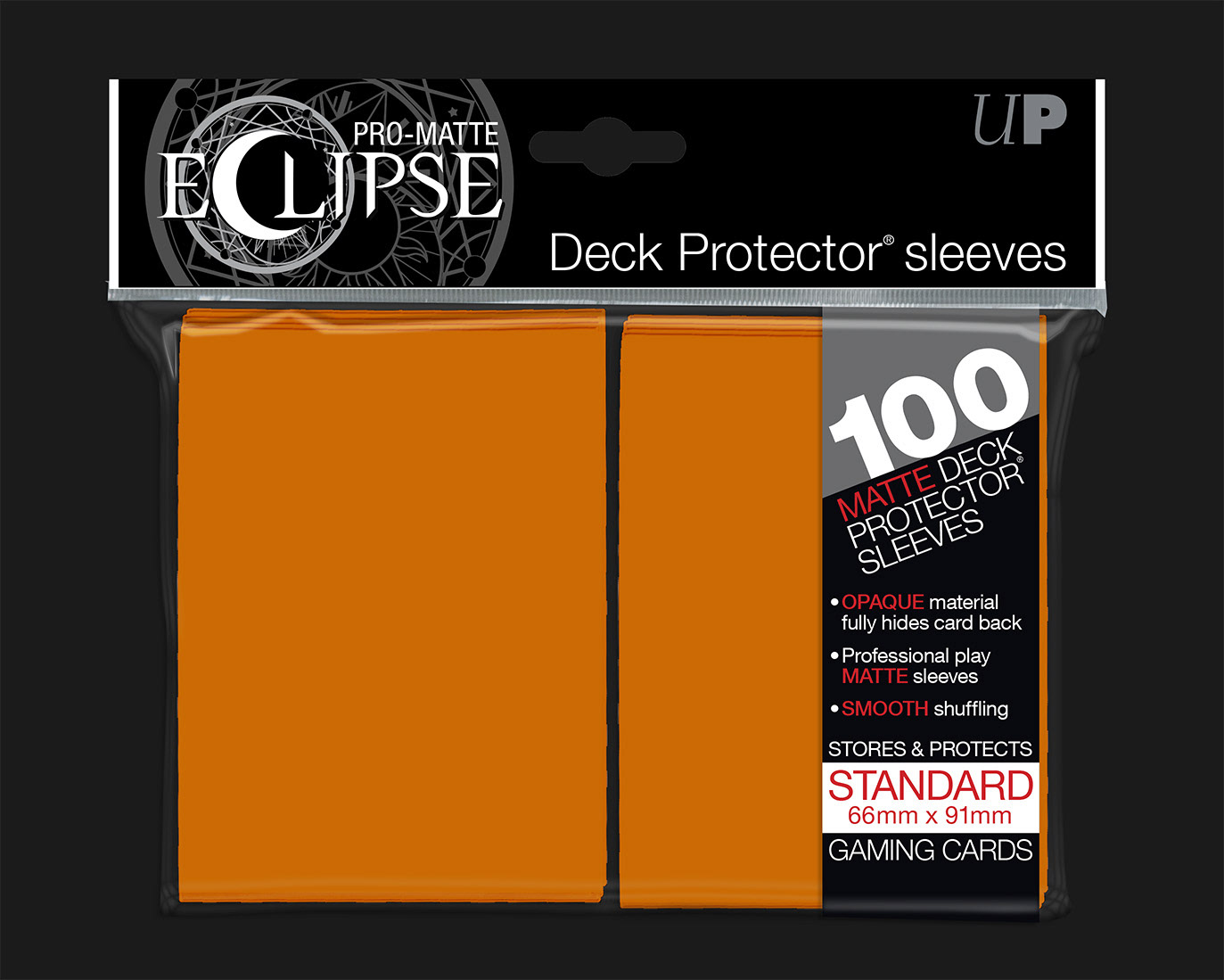
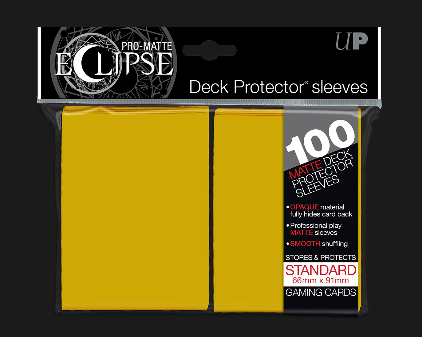
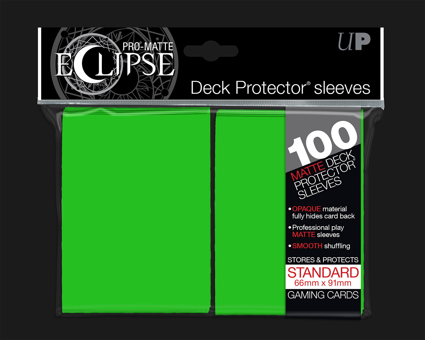
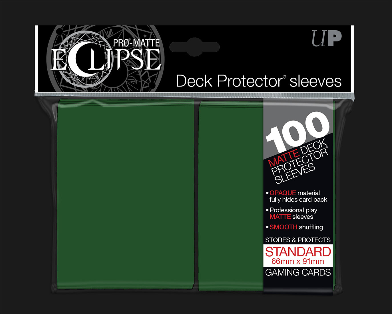
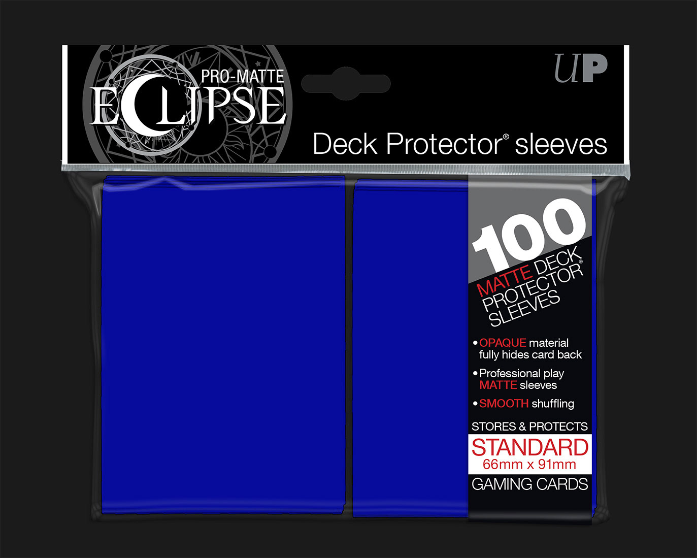
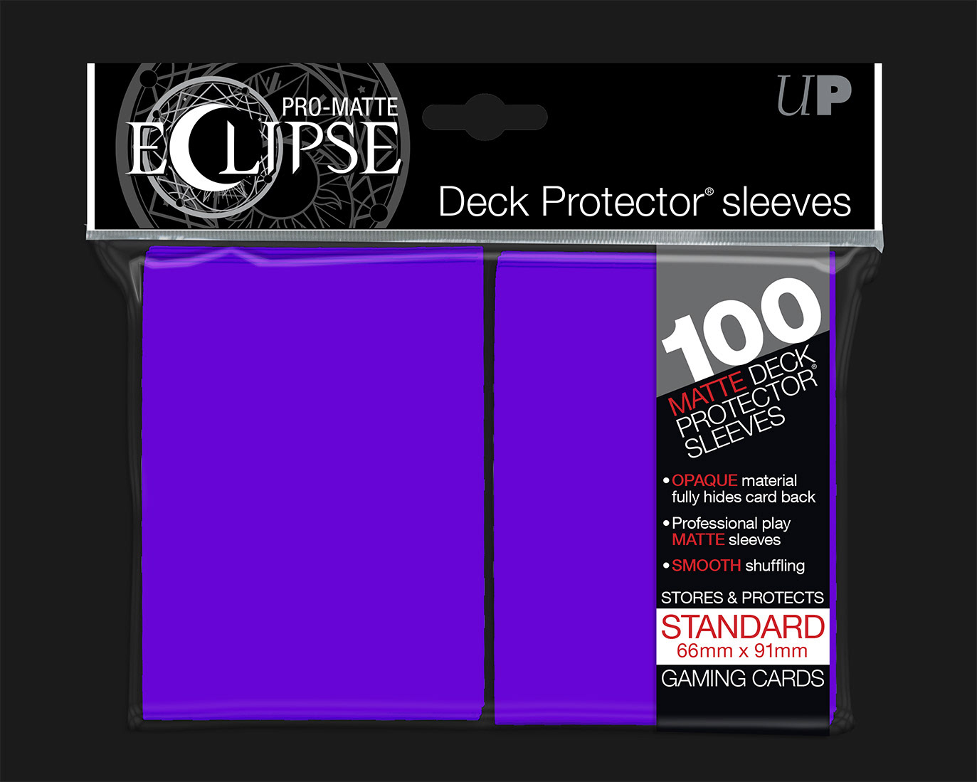
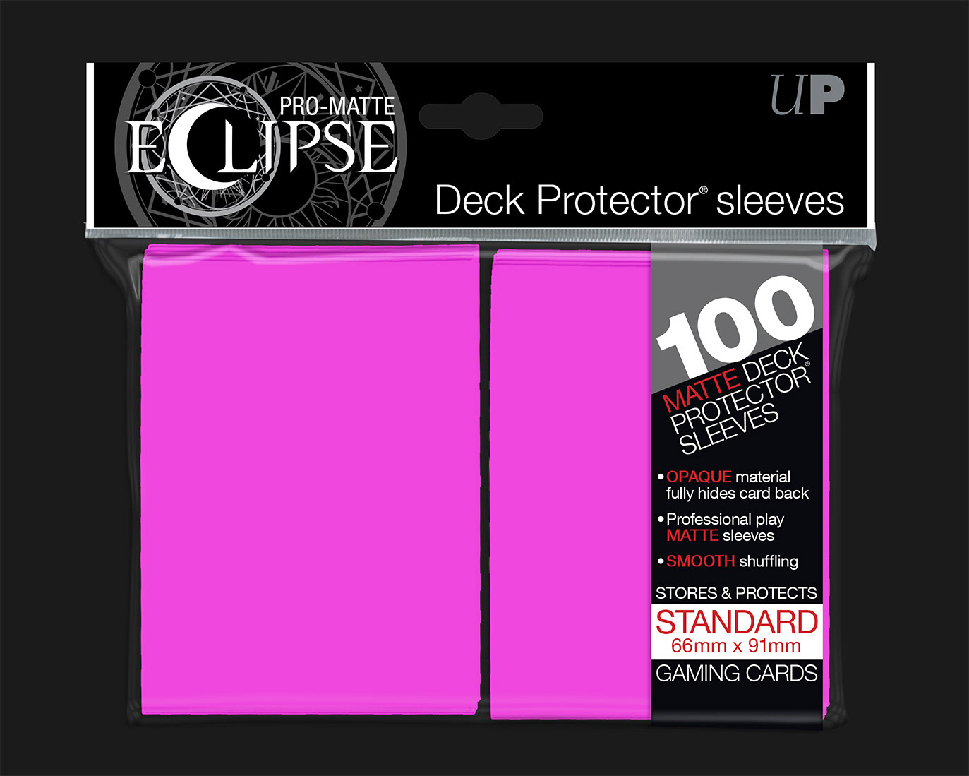
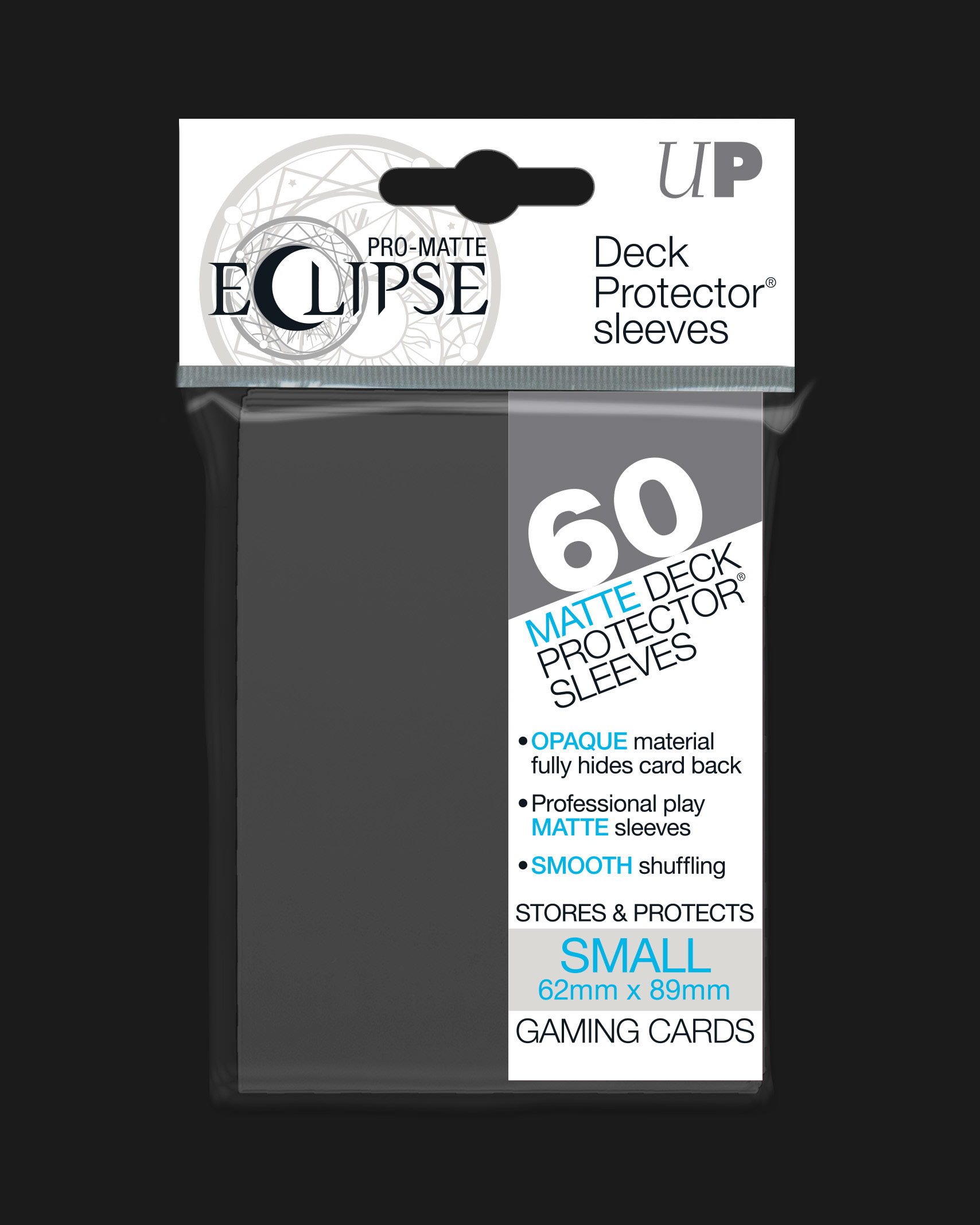
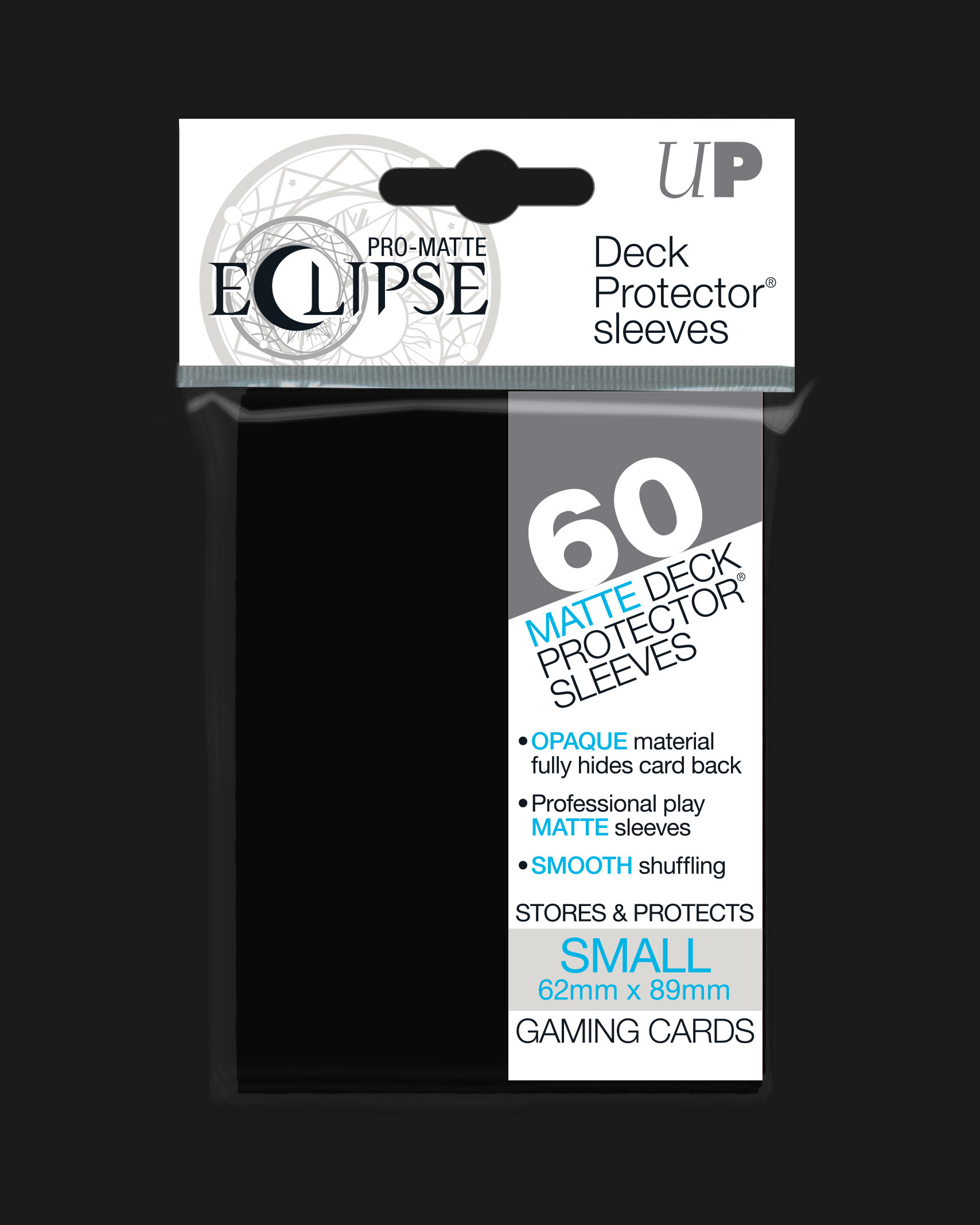
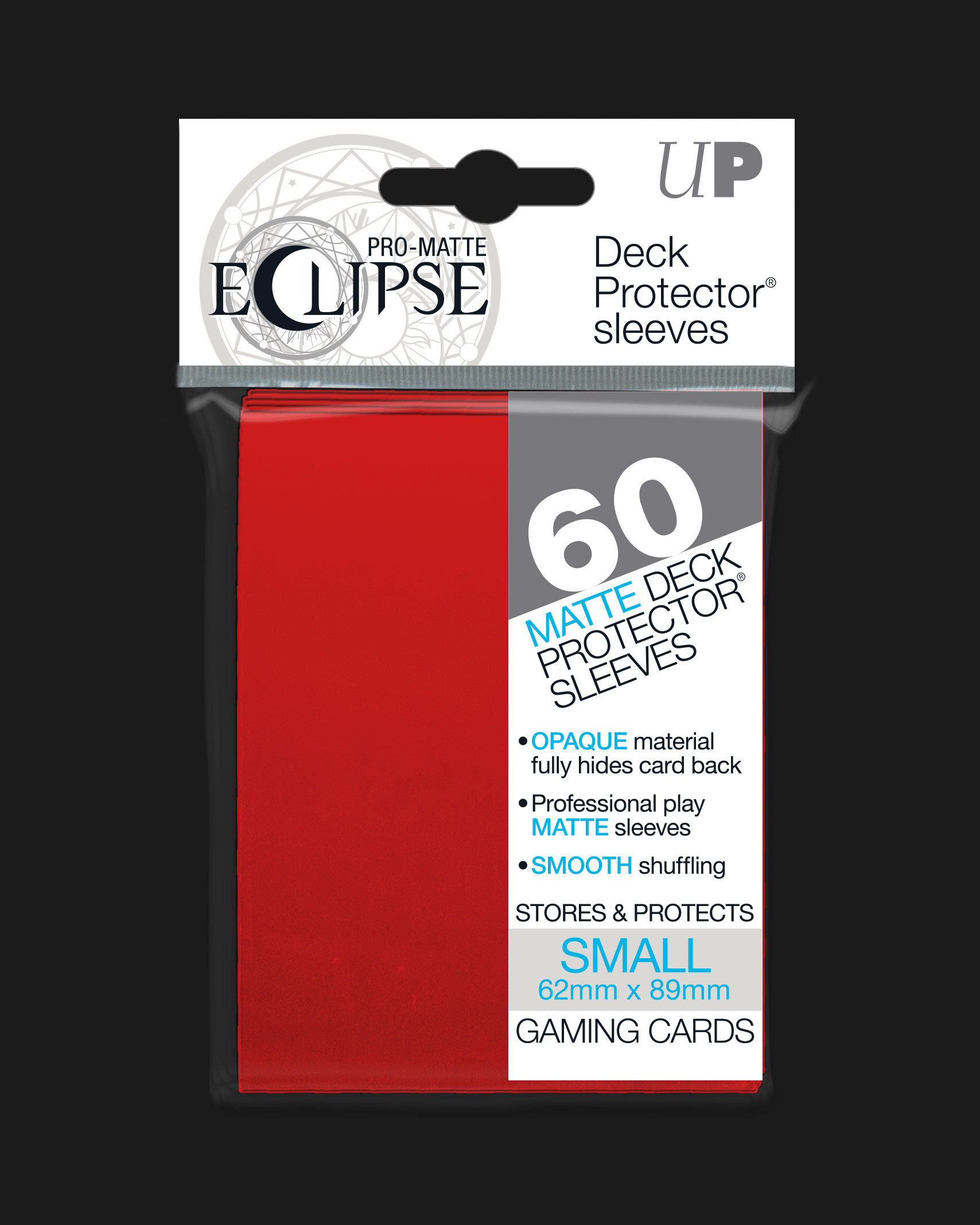
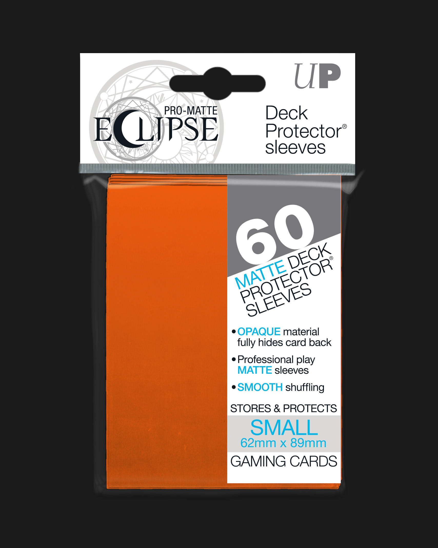
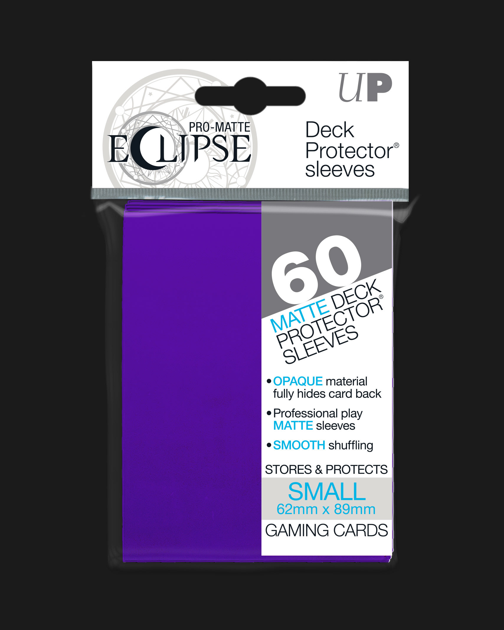
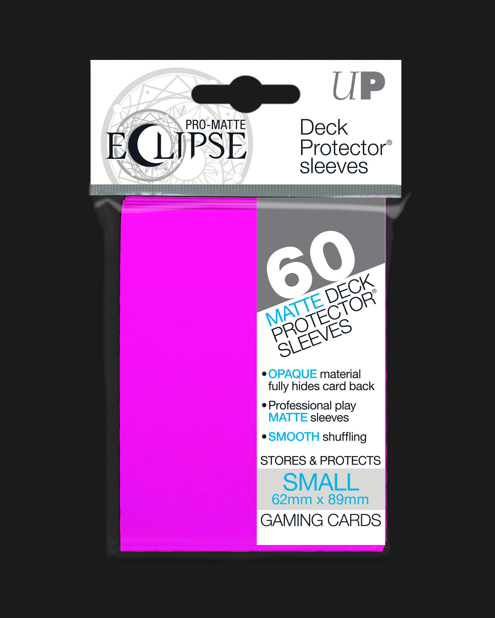
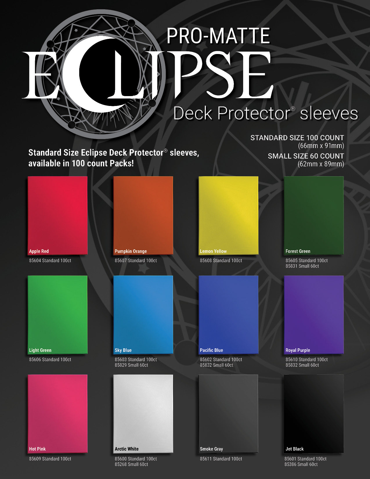
Eclipse Deck Protector Sleeves Product Lineup | Standard TCG Size
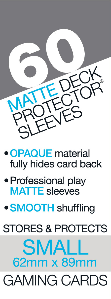
Japanese Size Branding
The branding for Japanese size TCG cards uses the same elements modified for a light color scheme, maintaining brand constancy while differentiating the product.
Eclipse Japanese TCG size sidebar, header and color proof
Eclipse Deck Protector Sleeves Product Lineup | Japanese TCG Size
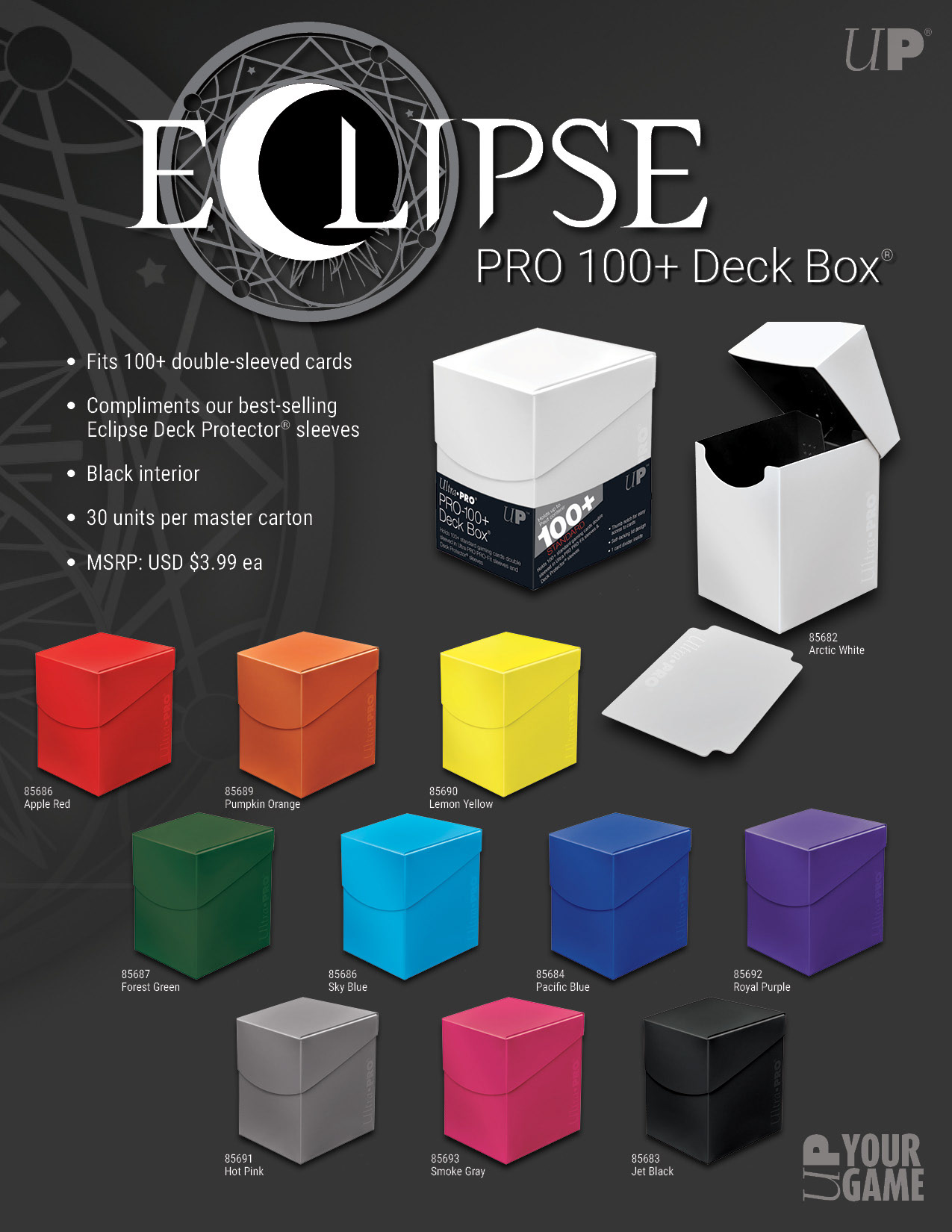
Eclipse Deck Protector Retail Display Box
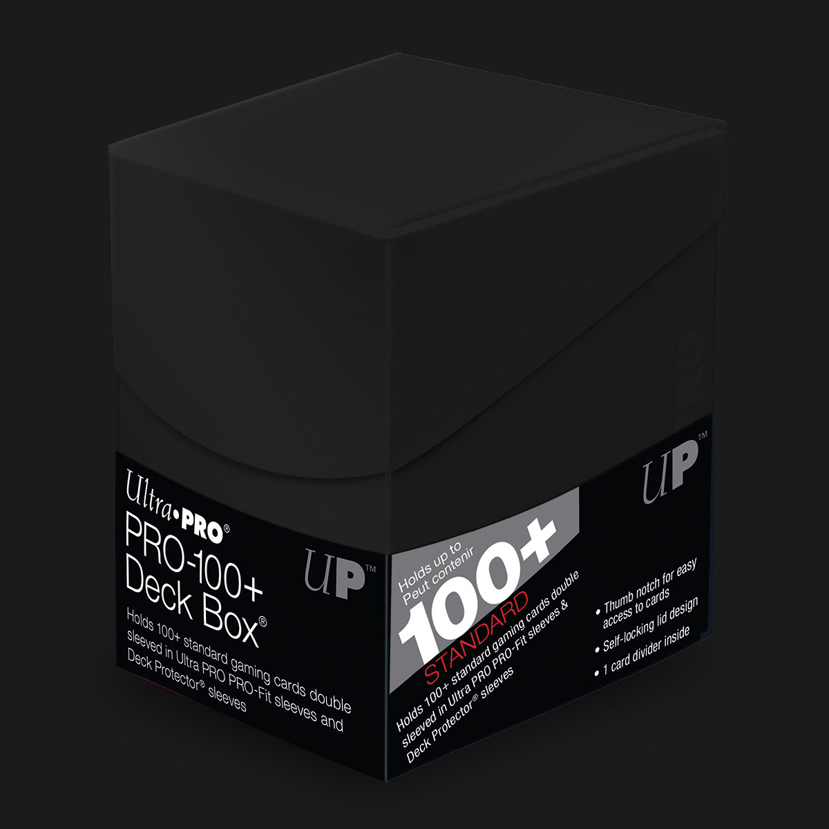
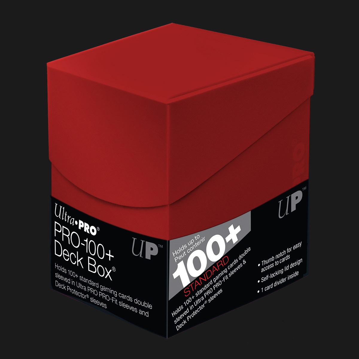
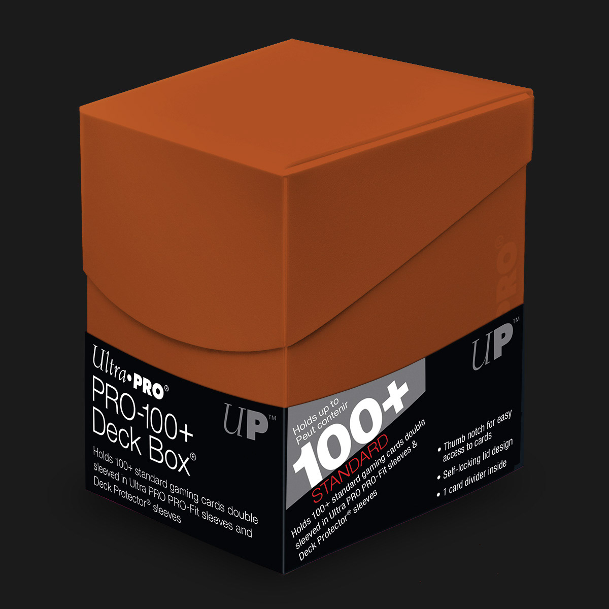
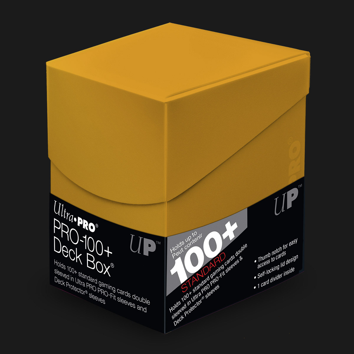
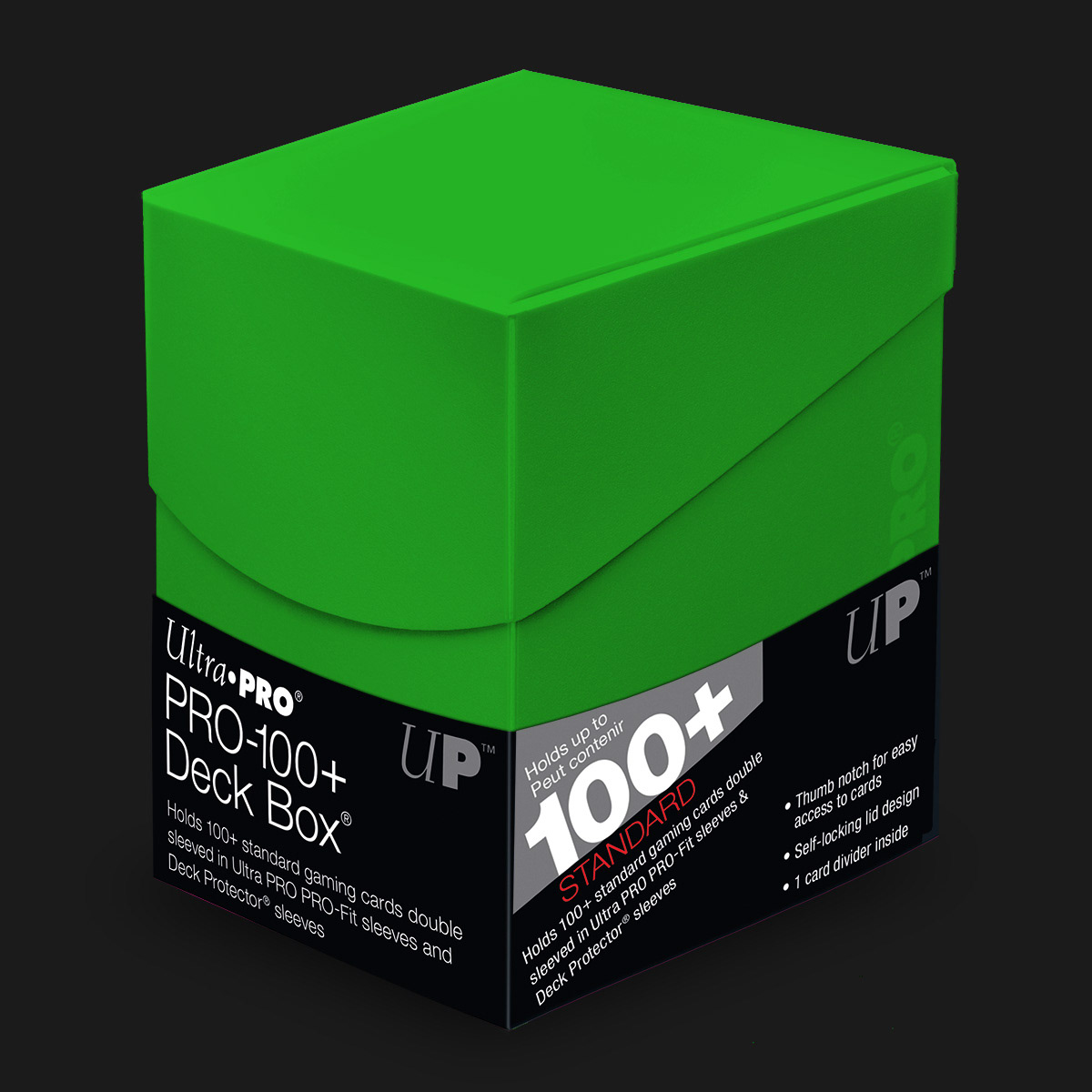
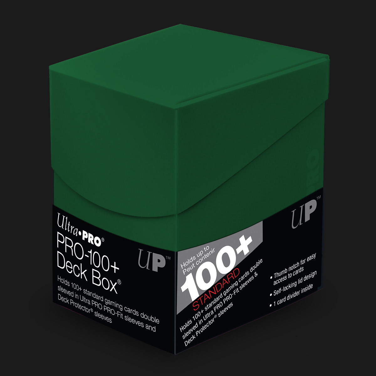
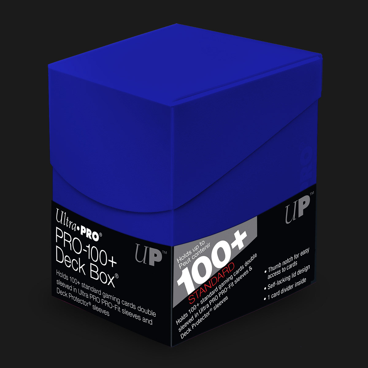
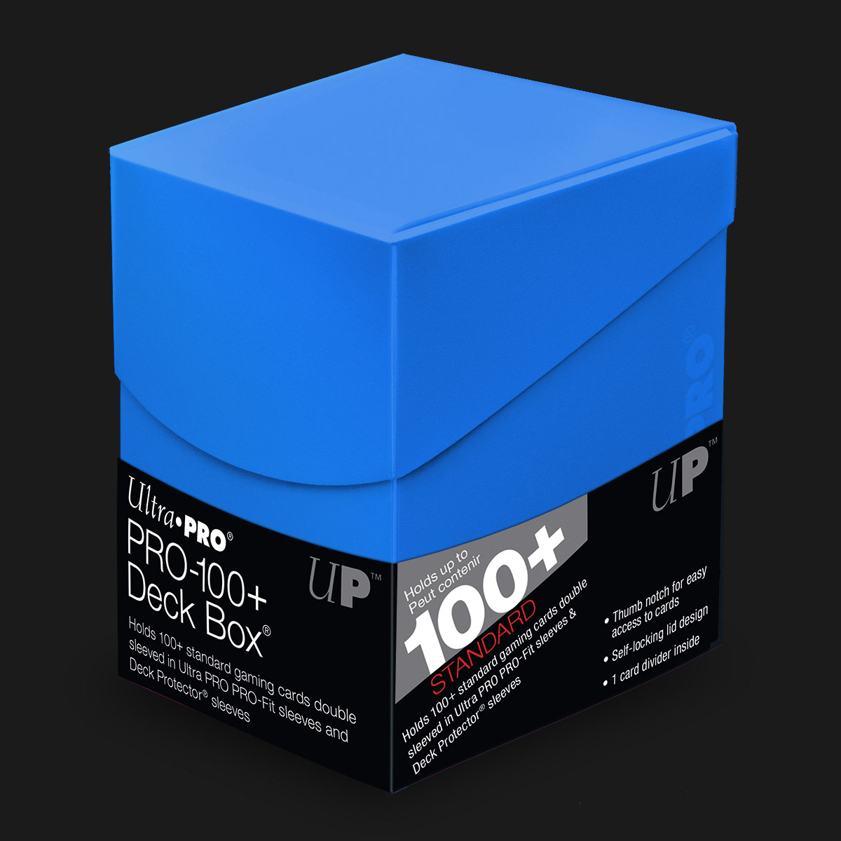
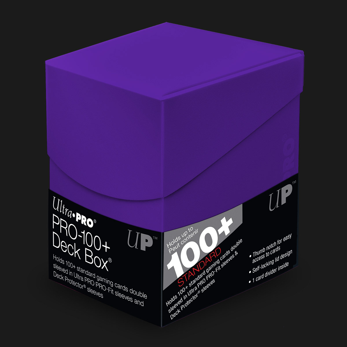
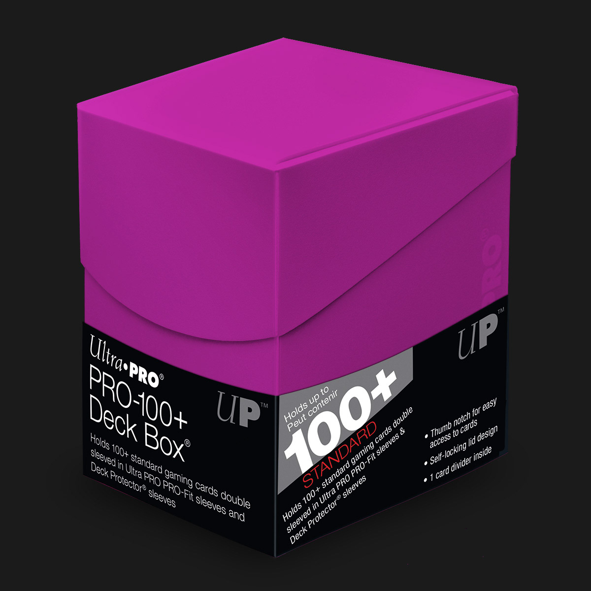
Eclipse Deck Box in Retail Packaging Lineup
Eclipse Product Brochure
From left to right: Cover, interior left, interior right, back cover
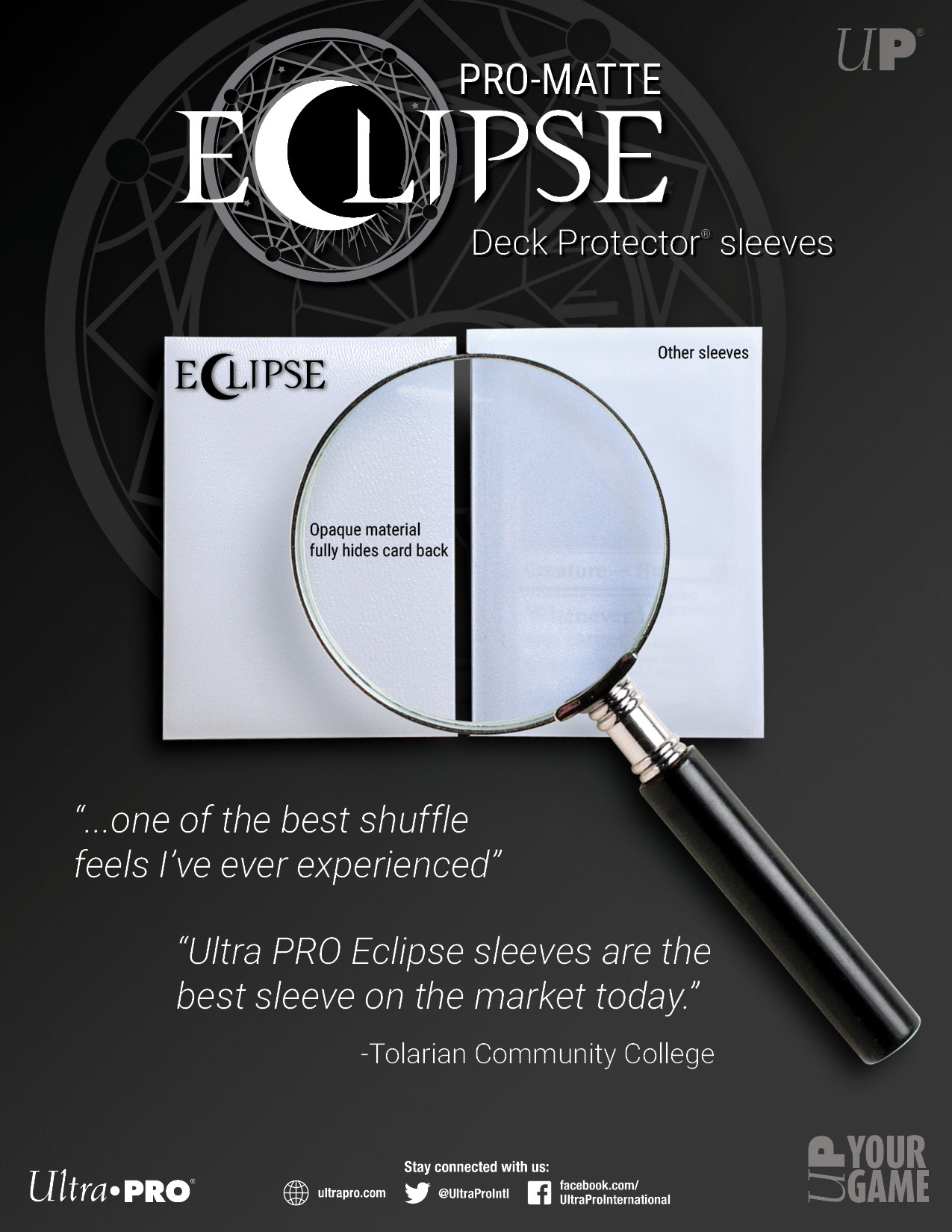
Eclipse Printed Flyer
Left: Front, Right : Back
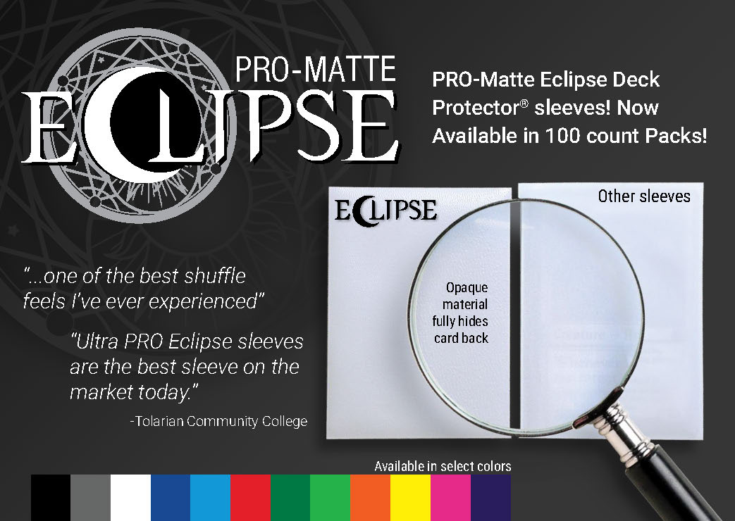
Web Images