Supreme Shield Card Sleeves
Art Direction, Branding & Product Packaging
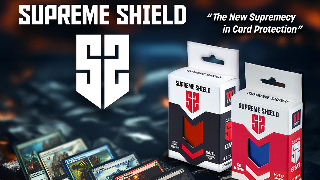
The scope of the project required developing a visual identity, including product logos and retail packaging design and artwork. The client provided a dieline from the factory.
I revised the factory dieline to adjust the hang tab, which was too long. I also implemented a custom window so that the product would be visible, as the same packaging would be used for multiple product colors.
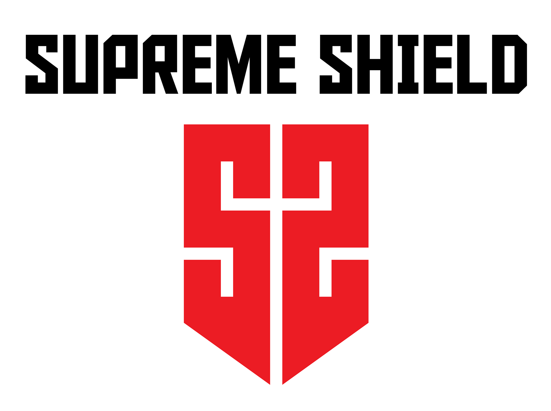
Visual identity emphasizes geometry and contrasting color and integrates these simple elements into a bold and modern design, demonstrated in the double "S" Shield logo and wordmark and realized in product packaging. Additionally, packaging incorporates multiple finishes for a premium feel.
Variations of retail packaging for two versions of the product were requested, one for Standard US size cards and another for Japanese size cards.
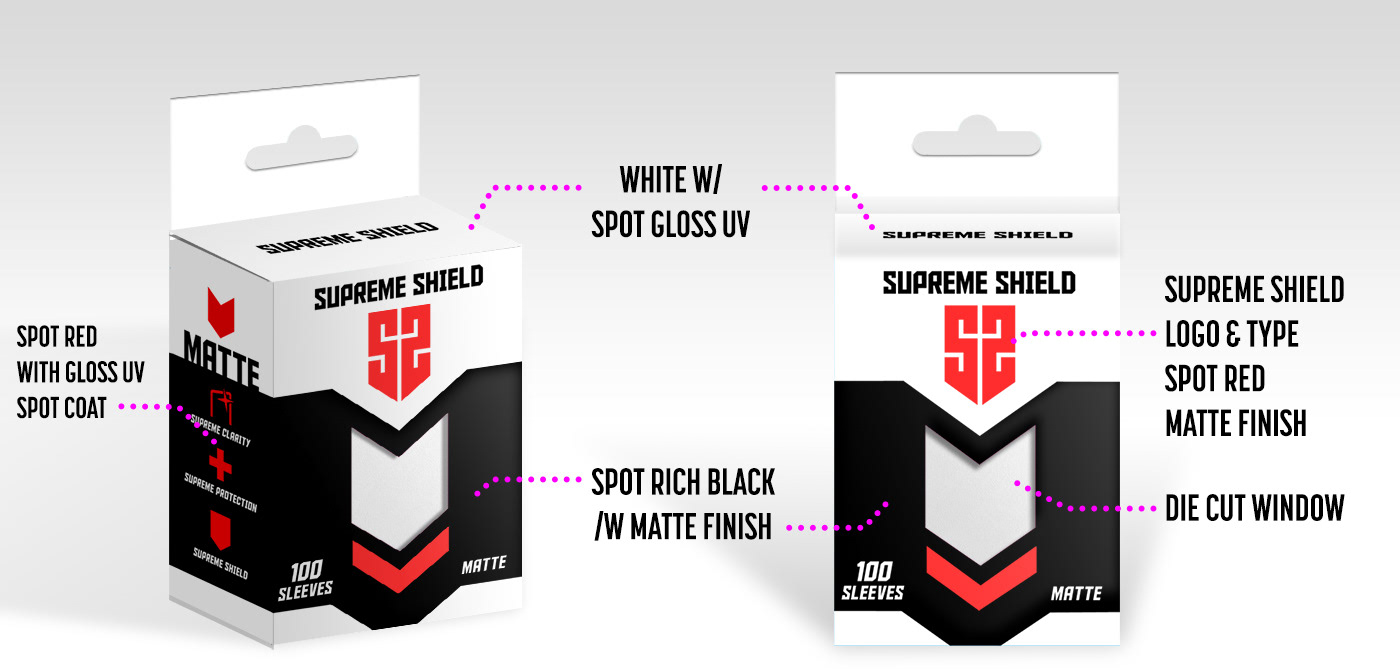
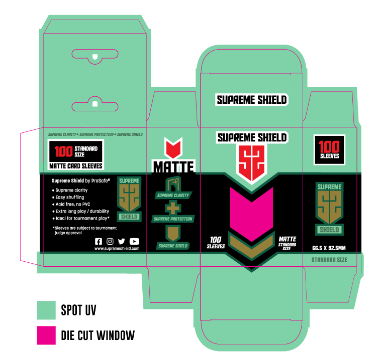

The US variant uses a bold 3-color scheme that is simple, yet is designed to stand out on retail shelves. Contrasting gloss spot UV on matte finished paperboard conveys a visual and tactile premium quality.
Logotype complements the emphasis on geometry while the copy typeface stays legible at small scales.
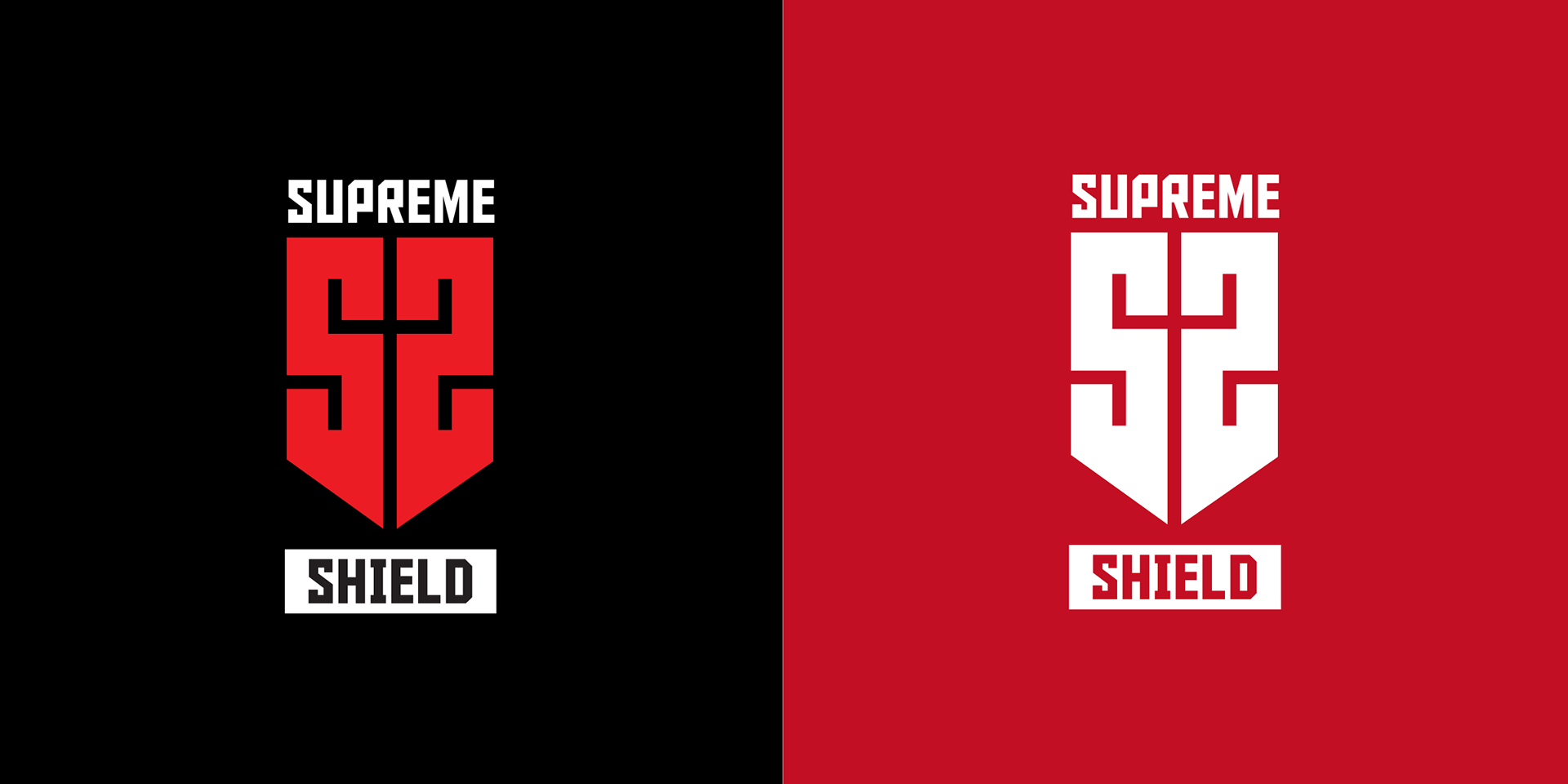
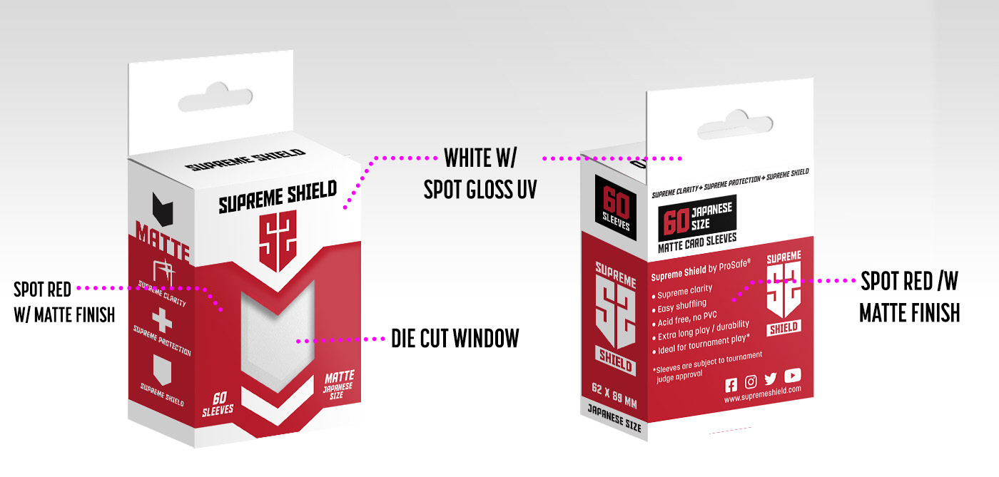
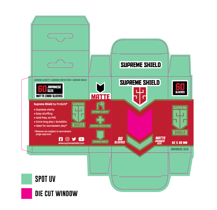

The variant for the Japanese size product emphasized a red and white color scheme, accented with black, to evoke a feeling of familiarity with the Japanese flag.

